POAP Design System
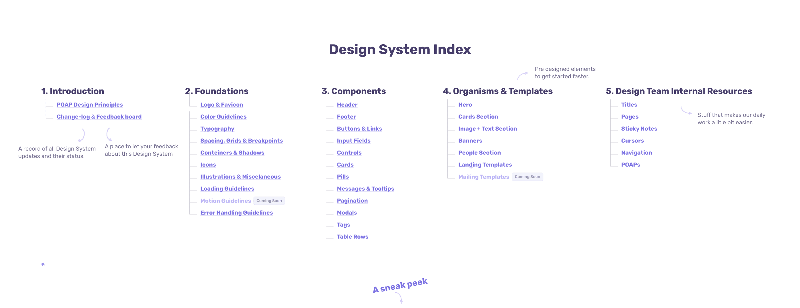
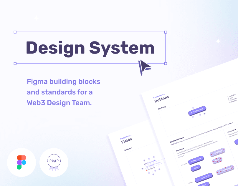
A unified design system for POAP, with typography, spacing, color, design tokens and consistent components.
About the project
At POAP, I reviewed and systematized the existing styles, organized the typography, spacing and color systems, created design tokens and unified components to establish a shared foundation for the product interfaces.
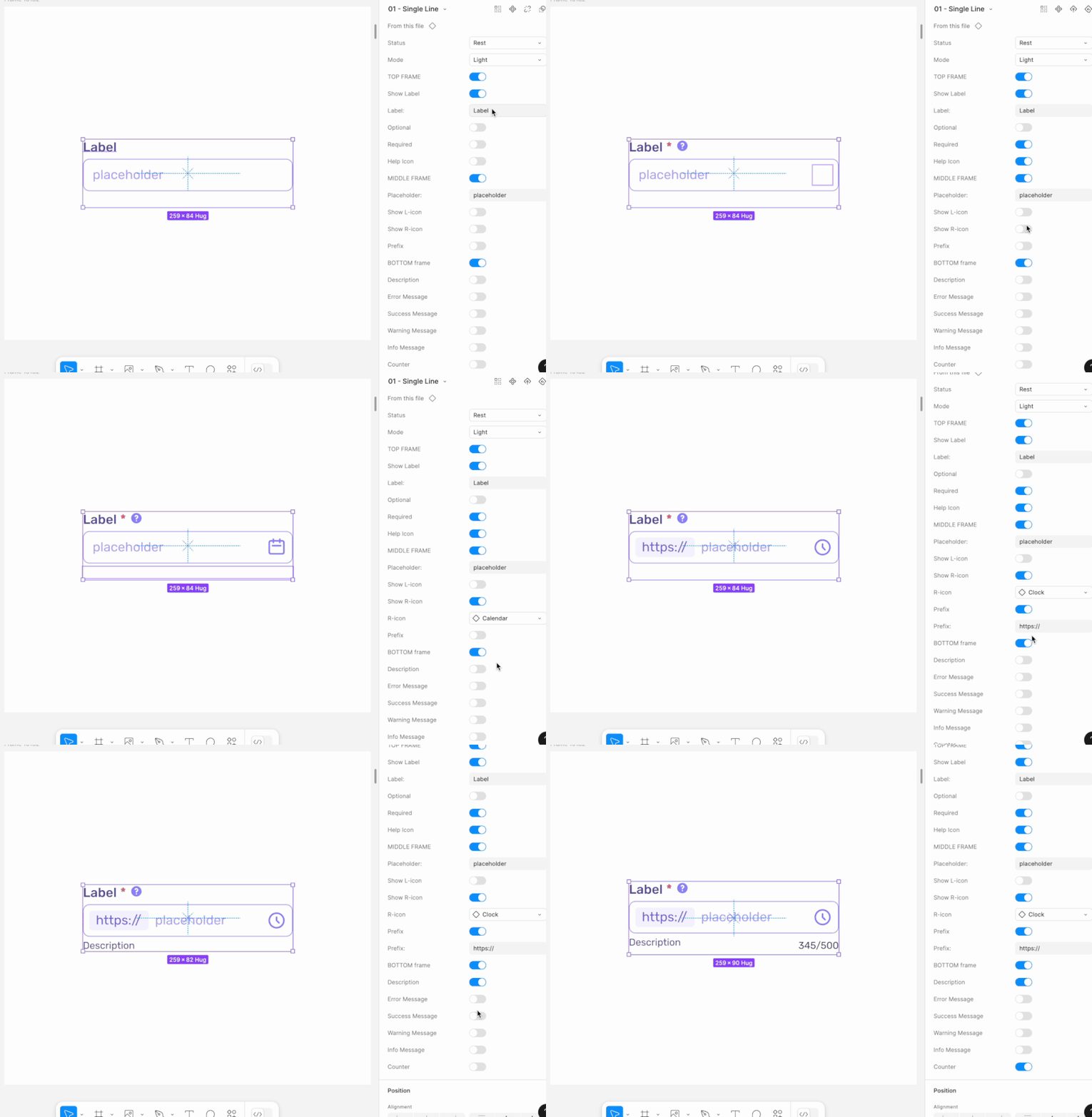
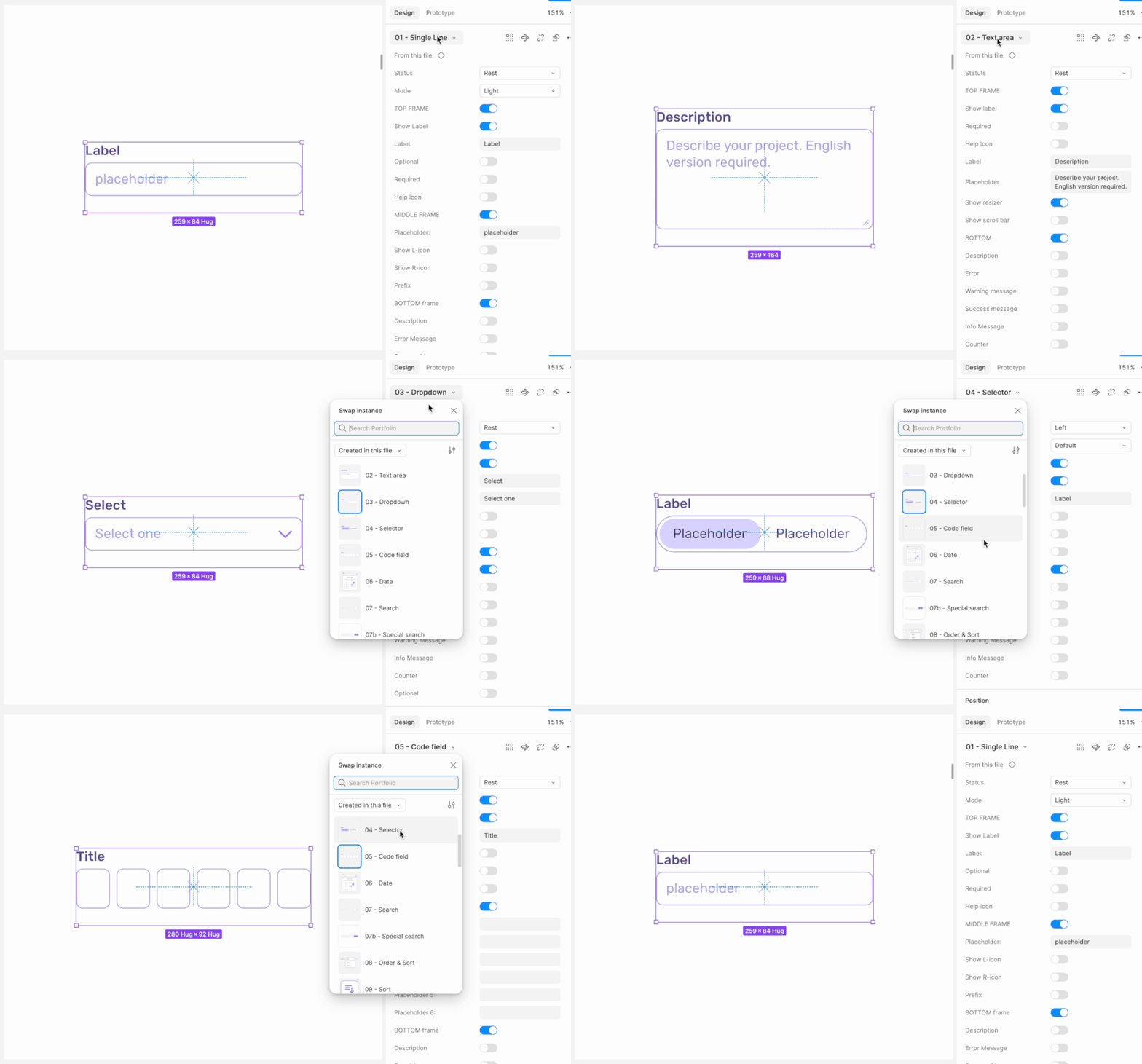
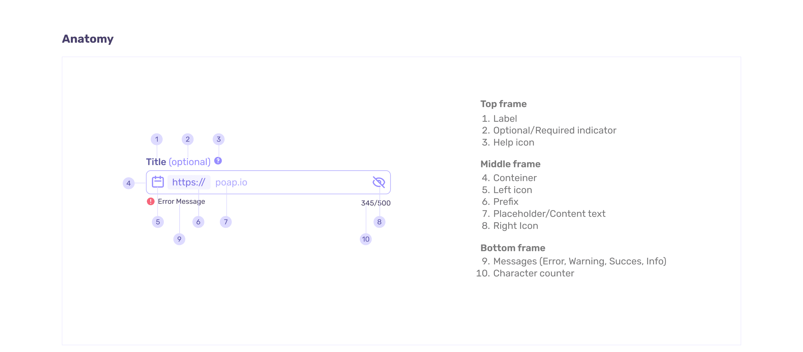
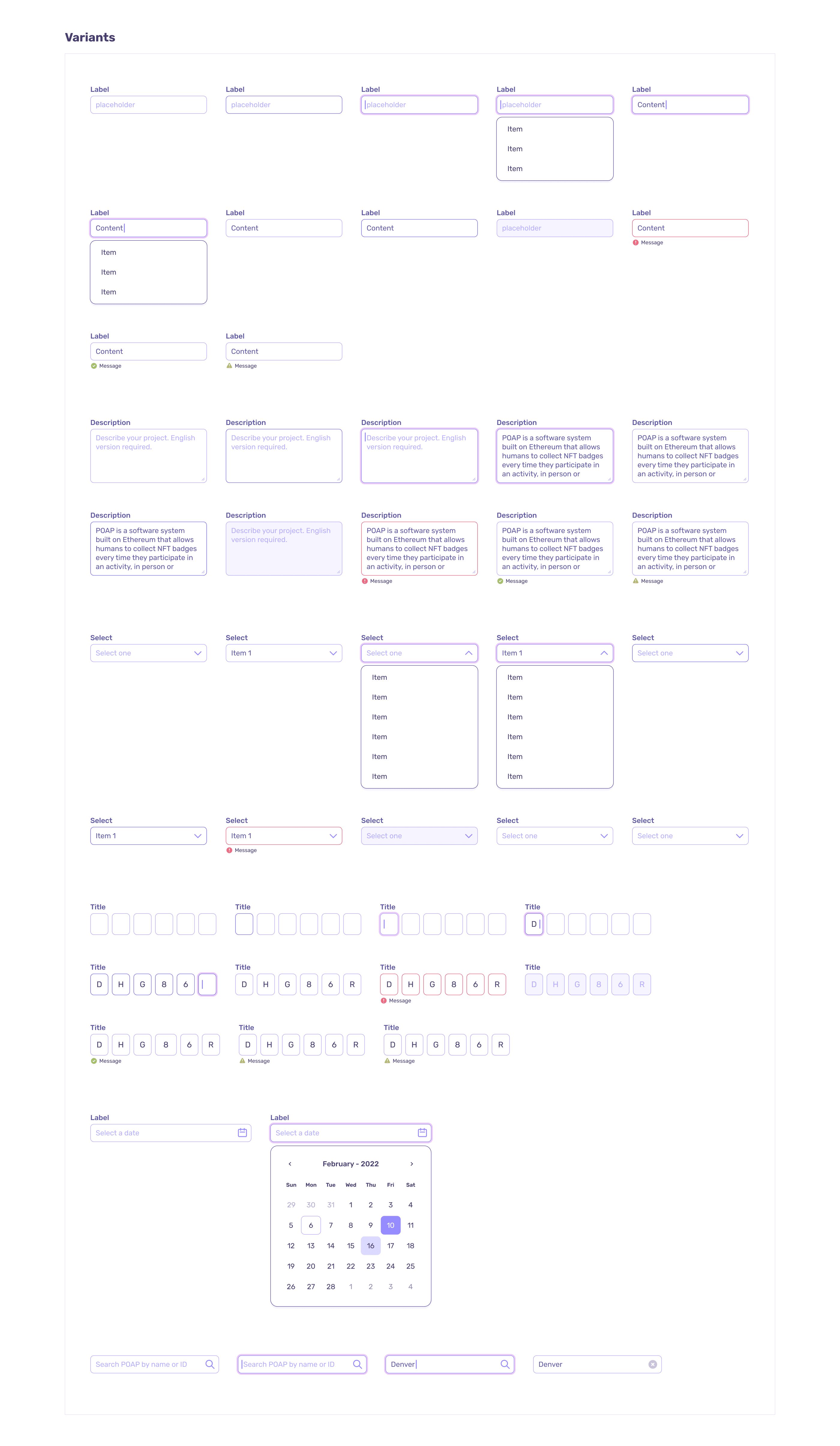
Designed scalable, reusable UI component libraries for web applications, including variants, states, responsive behaviors, and design tokens.
Overview
I turned scattered styles and components into a shared design foundation for POAP’s web products. Working with frontend engineering, I organized the visual foundations, defined primitive and semantic tokens, rebuilt reusable components and documented how to use and maintain the system.
The Challenge
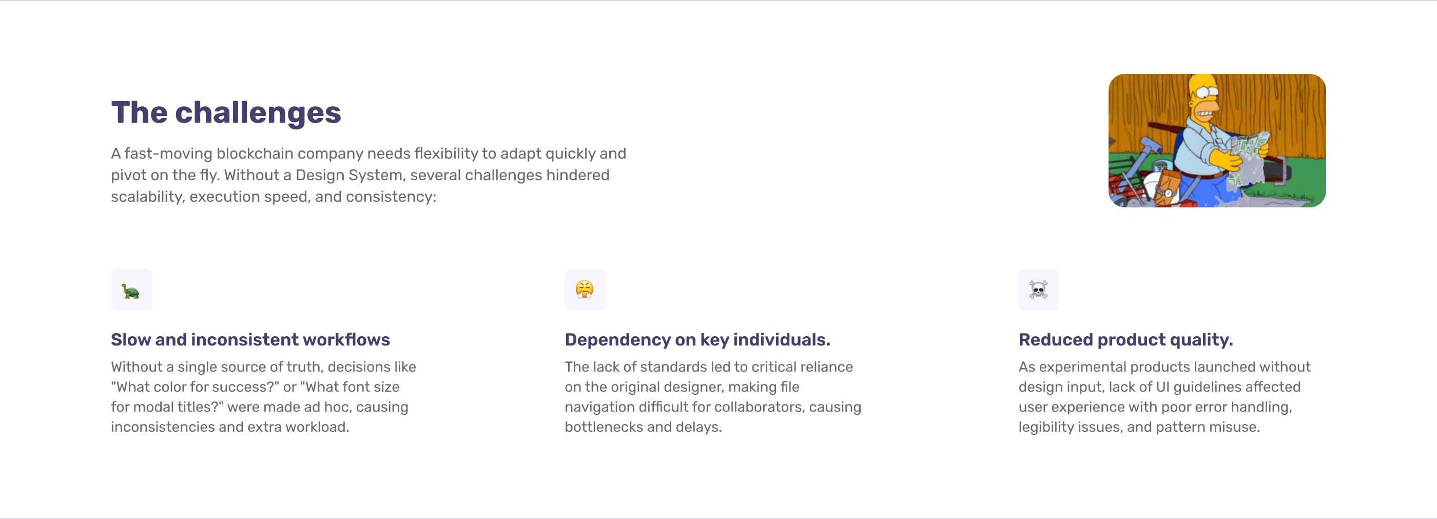
POAP needed to move quickly and adapt as its blockchain products evolved, but the team had no single source of truth for interface decisions. Ad hoc choices slowed down everyday work and created inconsistencies across products.
Files and components depended heavily on the designers who originally created them, making collaboration and onboarding harder. Experimental products also lacked shared UI guidelines, leading to legibility issues, inconsistent error handling and patterns used out of context. The challenge was to introduce consistency without limiting the flexibility the team needed.
Process & Design Decisions
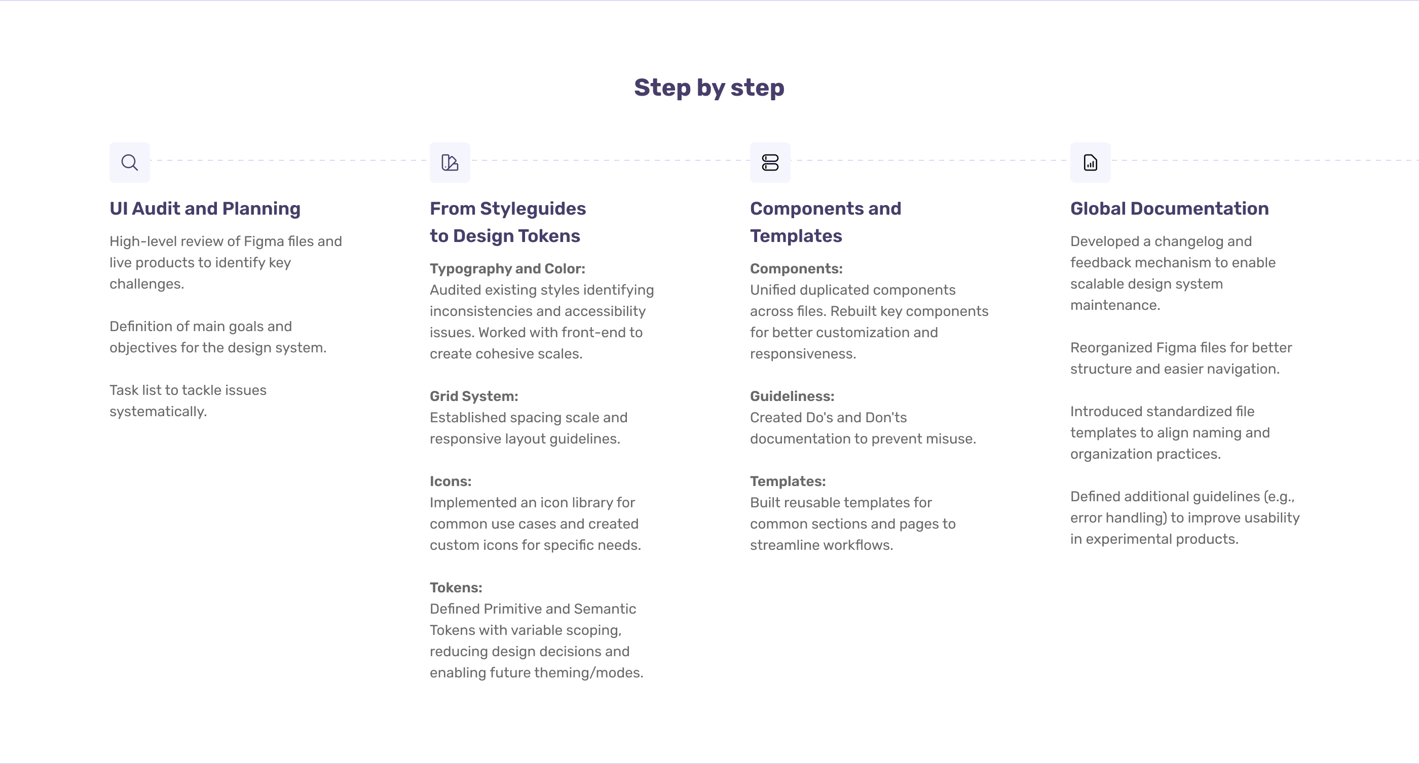
I started with a UI audit of the Figma files and live products, identified recurring problems and organized a plan around the team’s main needs.
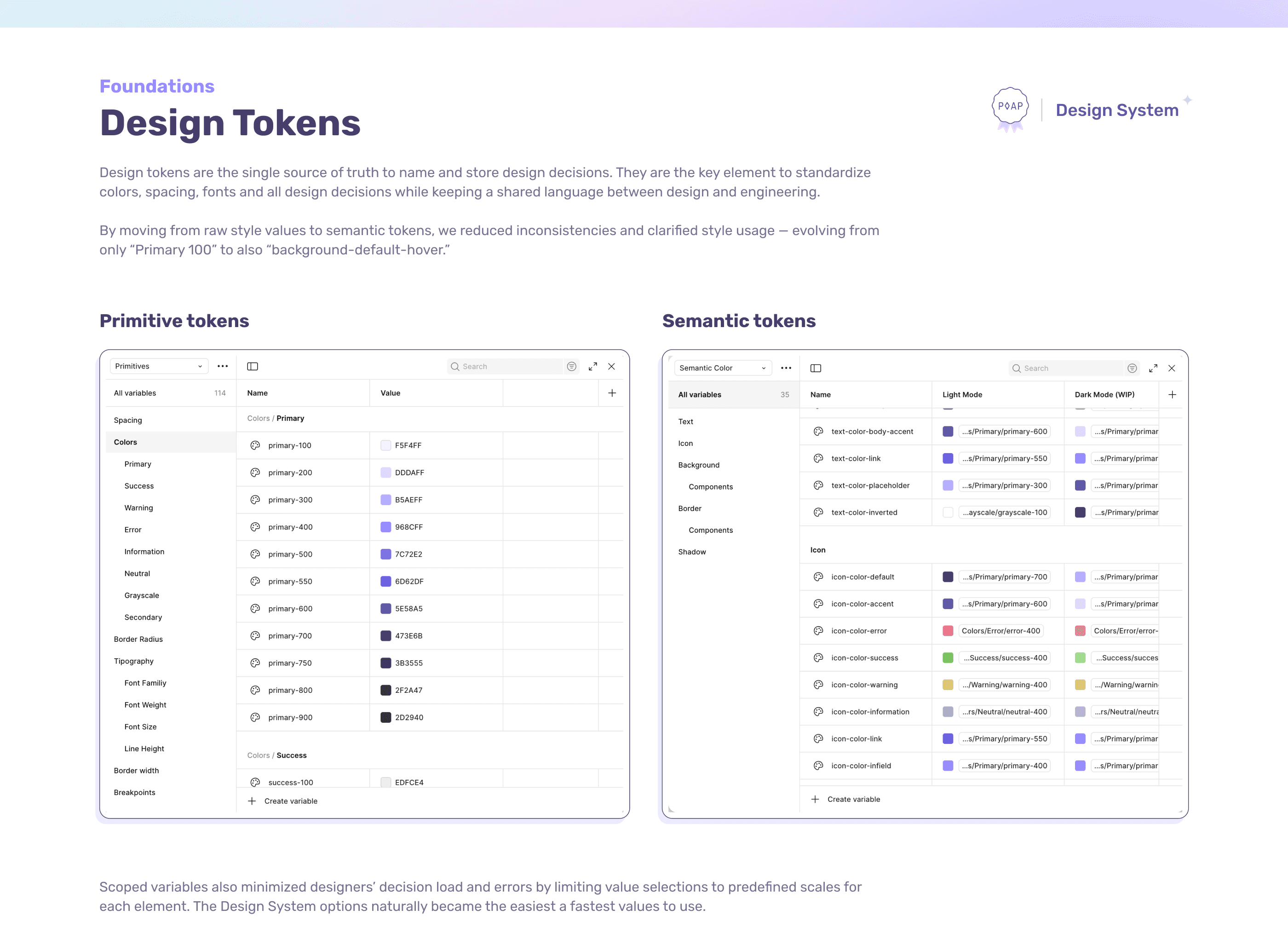
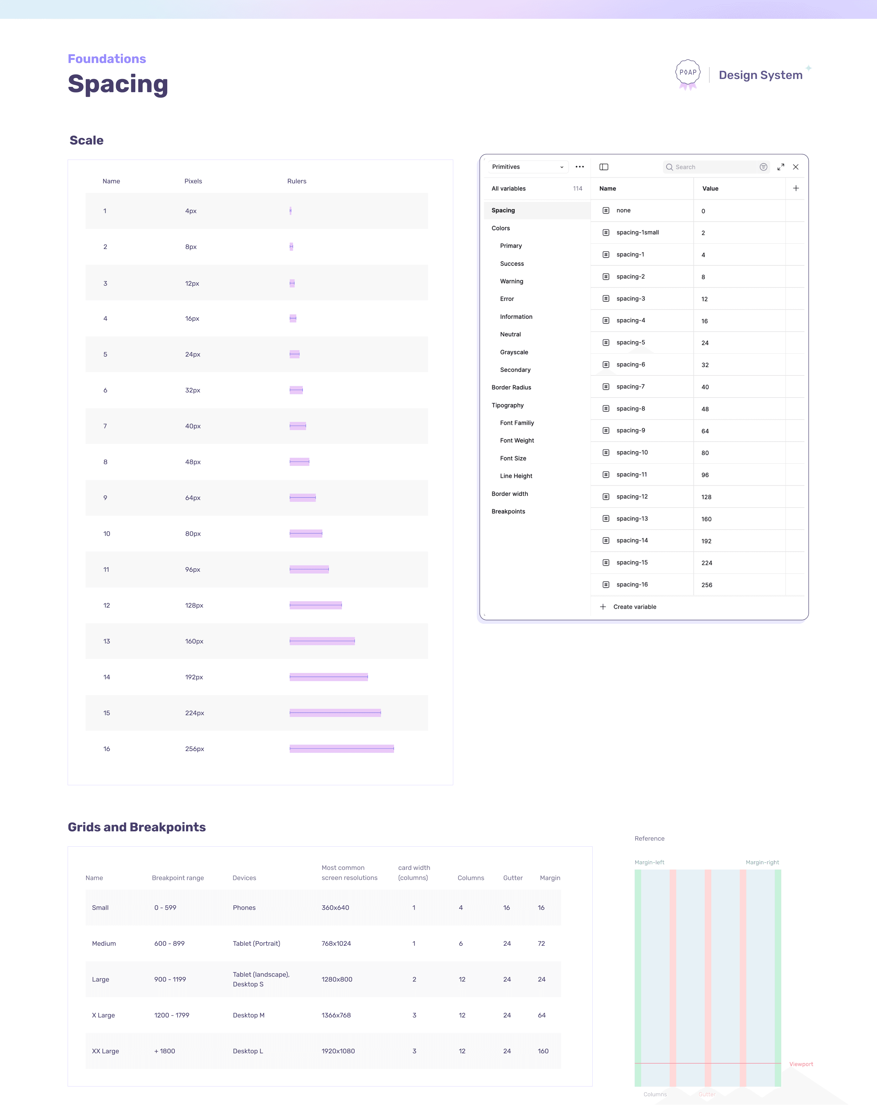
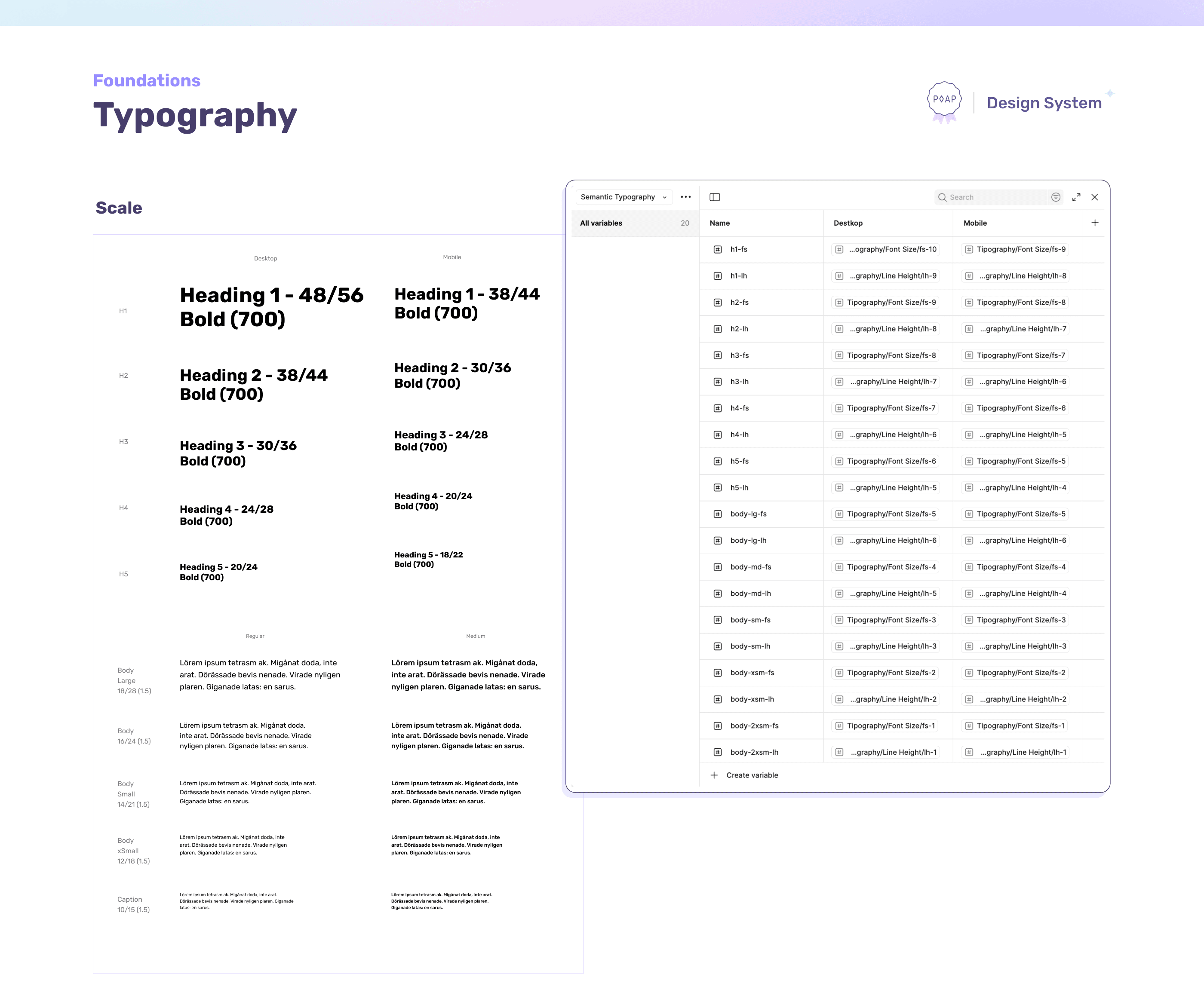
I reviewed color and typography for consistency and accessibility, working with frontend to establish cohesive scales. I defined spacing and responsive layout guidelines, organized the icon library and introduced primitive and semantic tokens. Scoped variables narrowed the available choices to the relevant values, while semantic naming made their intended use clearer and prepared the system for future themes and modes.
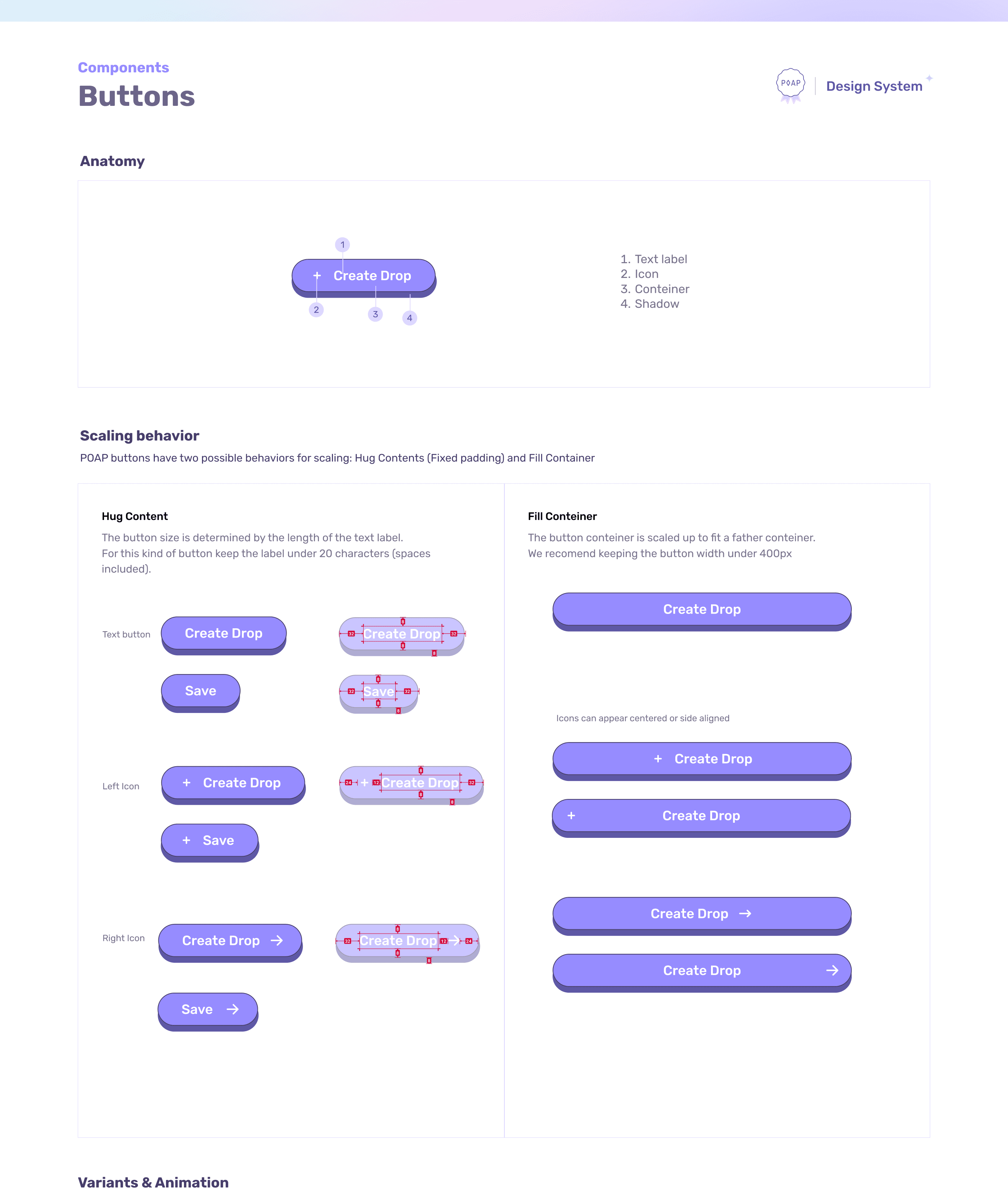
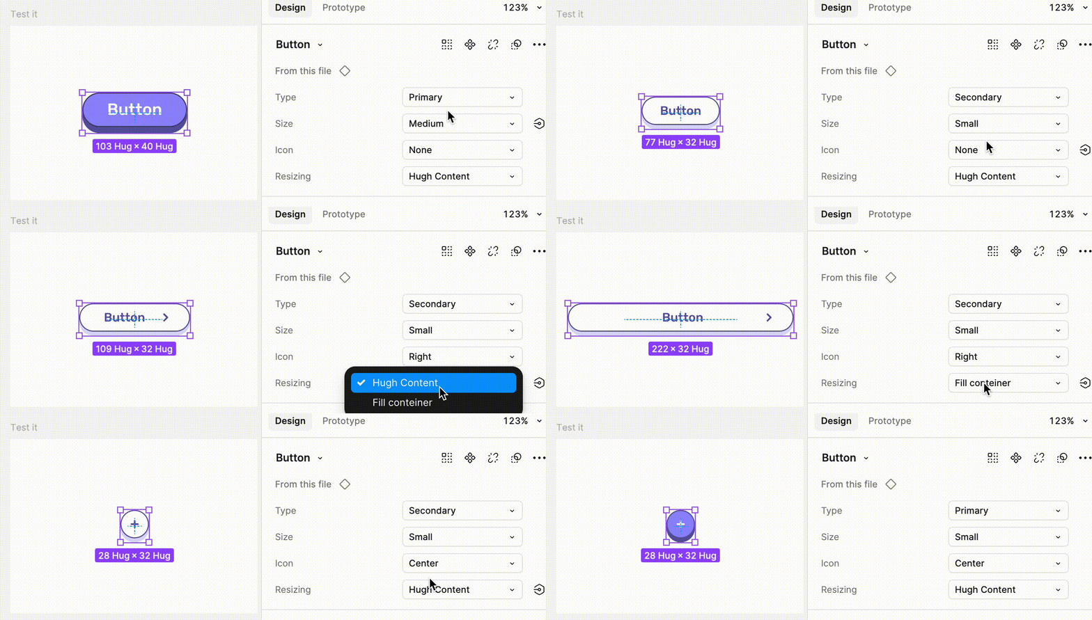
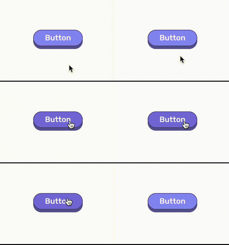
I consolidated duplicate components and rebuilt key elements with variants, states and responsive behaviors. Usage guidelines, do’s and don’ts, reusable sections and page templates helped the team apply the system consistently.
To support ongoing maintenance, I reorganized the Figma files, standardized file templates and introduced a changelog and feedback mechanism. Additional guidelines, including error handling, extended the system beyond its visual foundations.
Results & Learnings
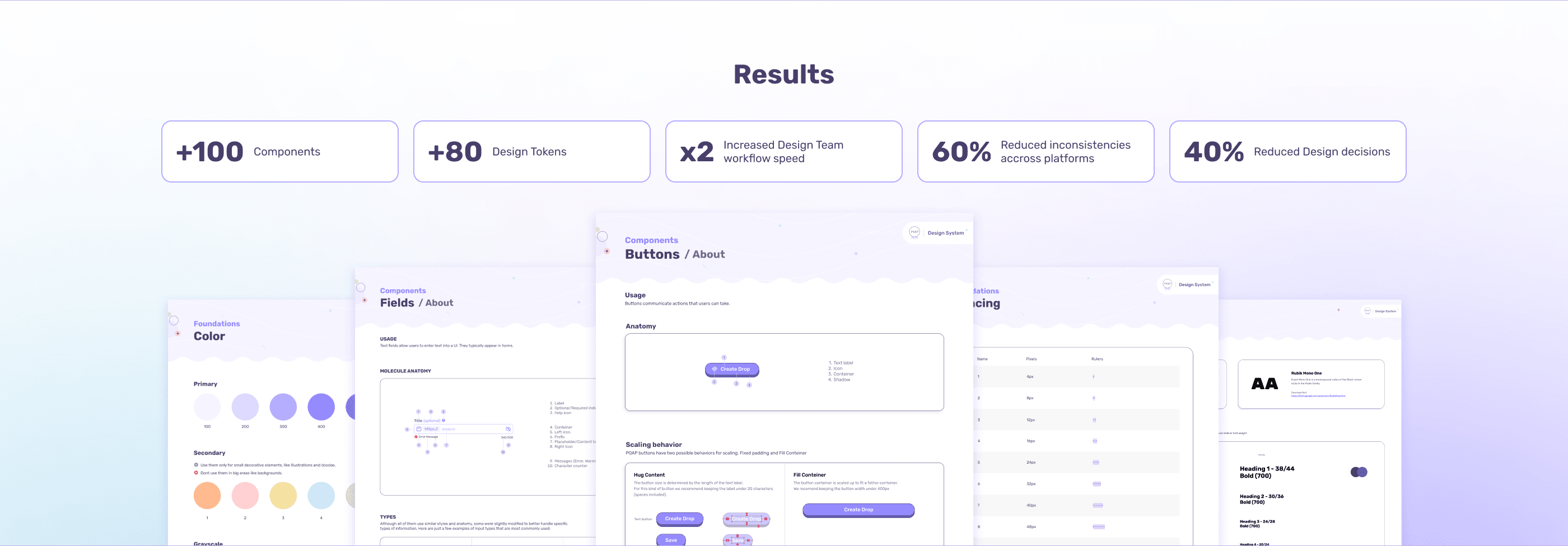
The system brought together 100+ components and 80+ design tokens, giving the team a shared foundation for building and evolving POAP’s interfaces. Reusable patterns and clearer documentation reduced repeated decisions and reliance on individual designers.
The case study reports 2× faster design workflows, 60% fewer inconsistencies across platforms and 40% fewer design decisions.
A key takeaway was that a design system needs more than a component library: clear naming, guidance, file organization and a way to collect feedback are essential to making it useful in everyday work and sustainable as products evolve.