POAP Moments Product Redesign
Redesigning how people discover, share, and preserve memories through
POAP Moments, a blockchain-based platform for shared experiences.
About the project
POAP Moments is a platform for sharing photos, videos, audio and messages linked to a POAP, bringing memories of shared experiences together. This project focused on a complete redesign of the product to make those memories easier to explore and contribute to.
Overview
I worked alongside product and engineering to rethink how people browse, discover and publish Moments. The redesign covered the site structure, key user flows, the feed and Moment detail views, with design handoff and QA to support implementation.
The Challenge
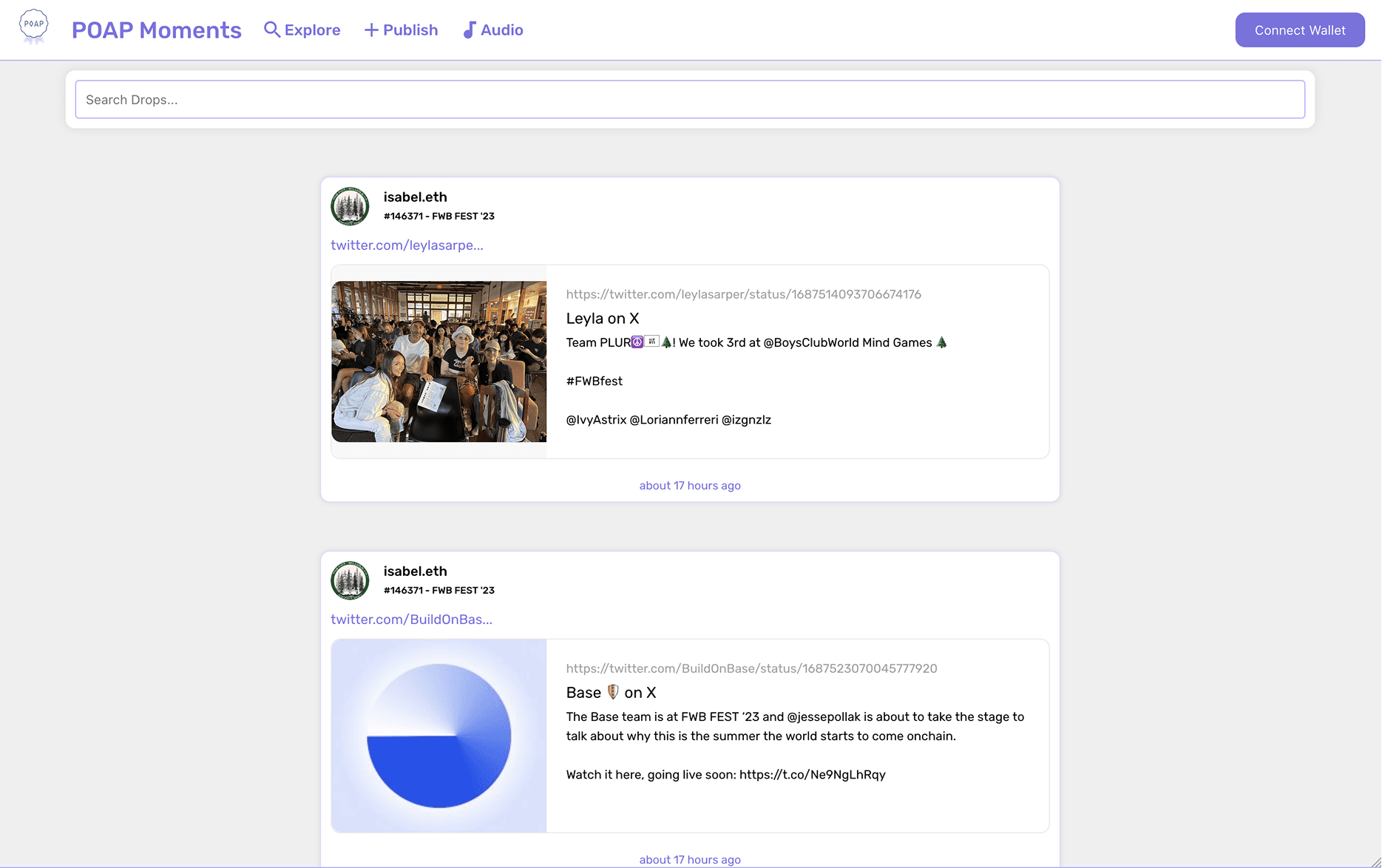
The initial audit revealed unclear navigation hierarchy, a single-column feed that showed little content, and a fragmented experience that separated audio from other media. Publishing involved unnecessary steps and offered limited feedback, while there were few paths to discover related events, creators or content.
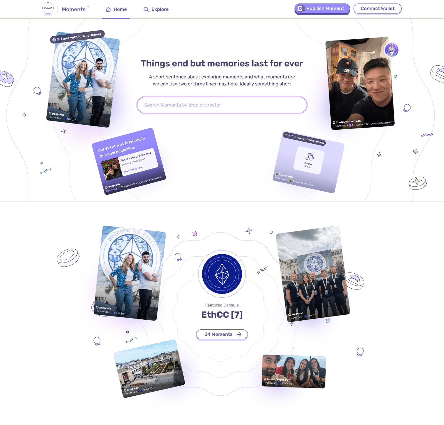
The challenge was to put content first, simplify navigation and contribution, and bring different media into one coherent experience without losing the playful character of the product.
Process & Design Decisions
I started by reviewing the existing experience and redefining the site structure, navigation and main user flows before moving into visual design.
I replaced the uniform single-column feed with a multi-column masonry layout that adapts to different media proportions. This lets more Moments appear together and gives a quicker sense of an event. Audio, text, images and links share a visual system, with color variations designed to add rhythm while maintaining contrast and legibility.
I developed the Moment detail views to bring the content, its creator, linked POAP and media information together. The publishing flow lets people add files, captions, a POAP and people tags in one experience. Design handoff and QA supported the transition from the designs to implementation.
Results & Learnings
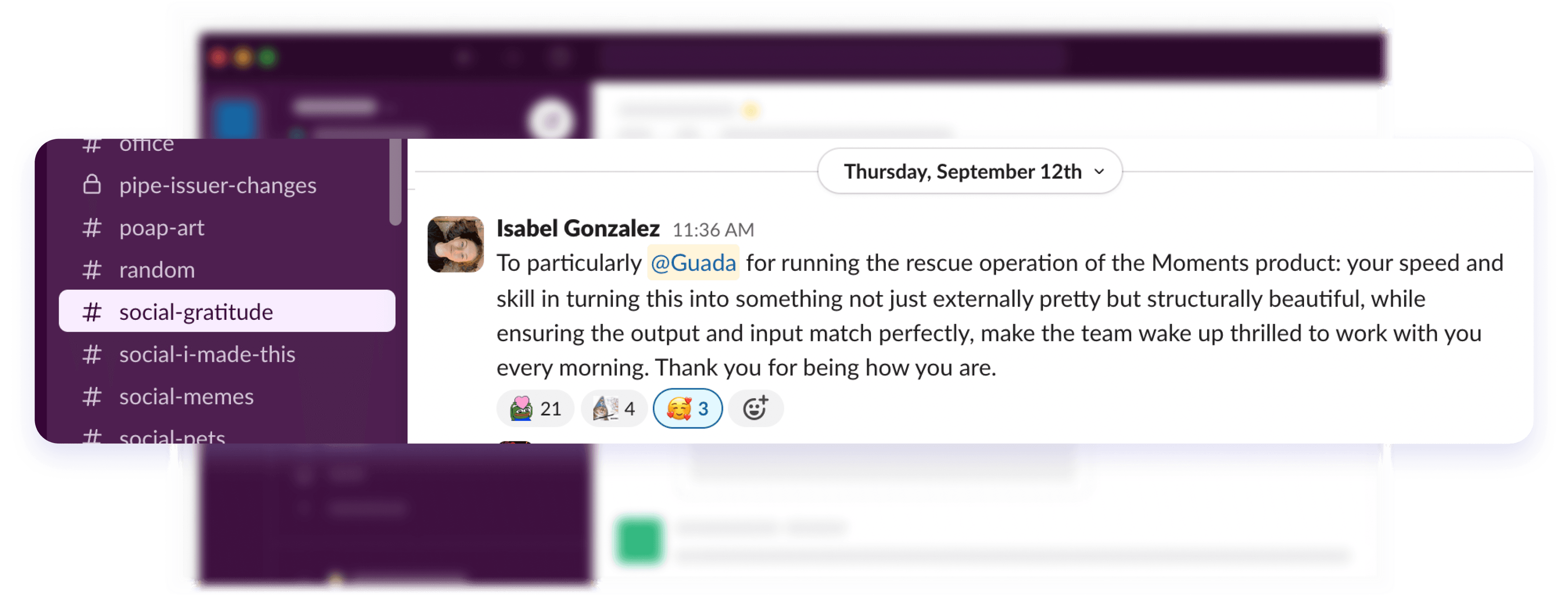
The redesign brought the different Moment formats into a shared feed, established a clearer navigation hierarchy and connected browsing, detail views and publishing through a consistent visual language. The team highlighted both the visual quality and the structural coherence of the work, including the alignment between what people enter and what the product displays.
A central takeaway was that visual richness depends on a clear underlying structure: flexible layouts and color variations are most useful when they help people understand and explore the content.