Tres Tipos - Typographic compositions
An editorial experiment combining Nilland, Nougatine and Blanch through typographic composition.
About the project
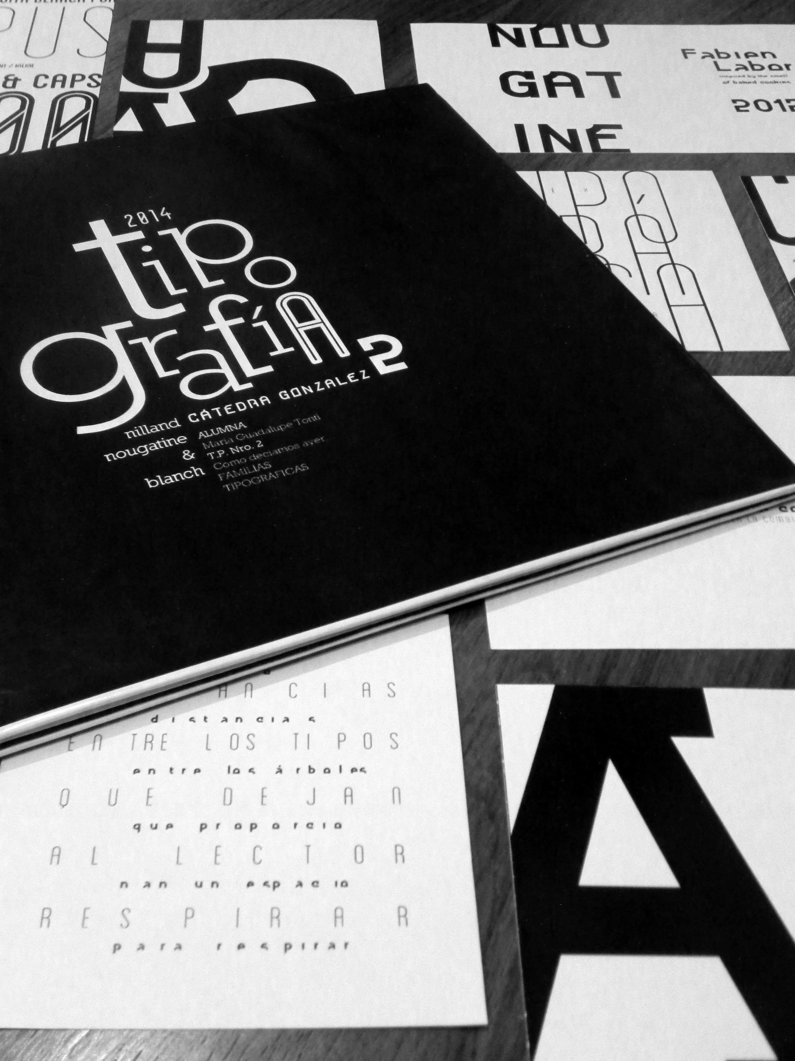
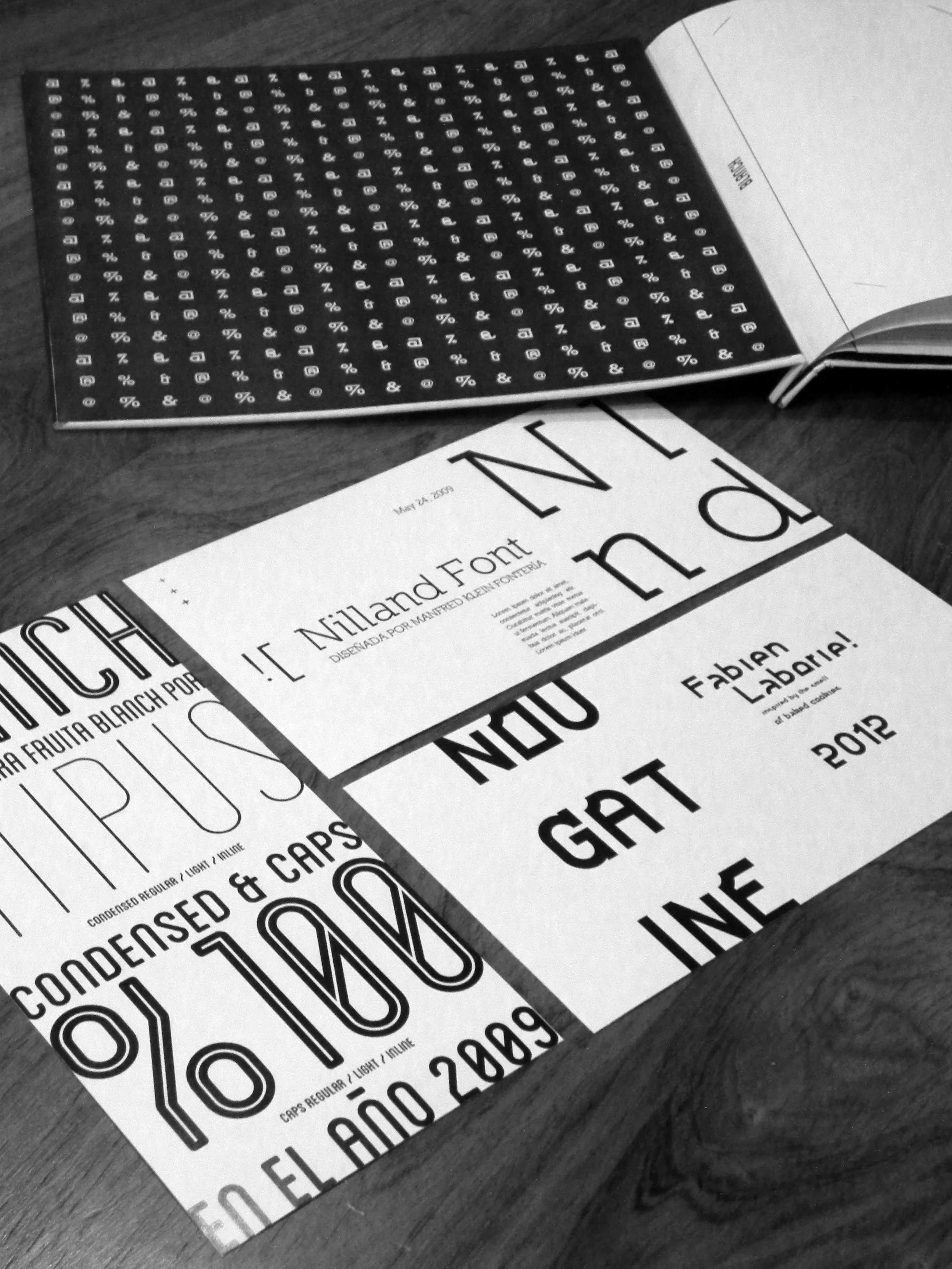
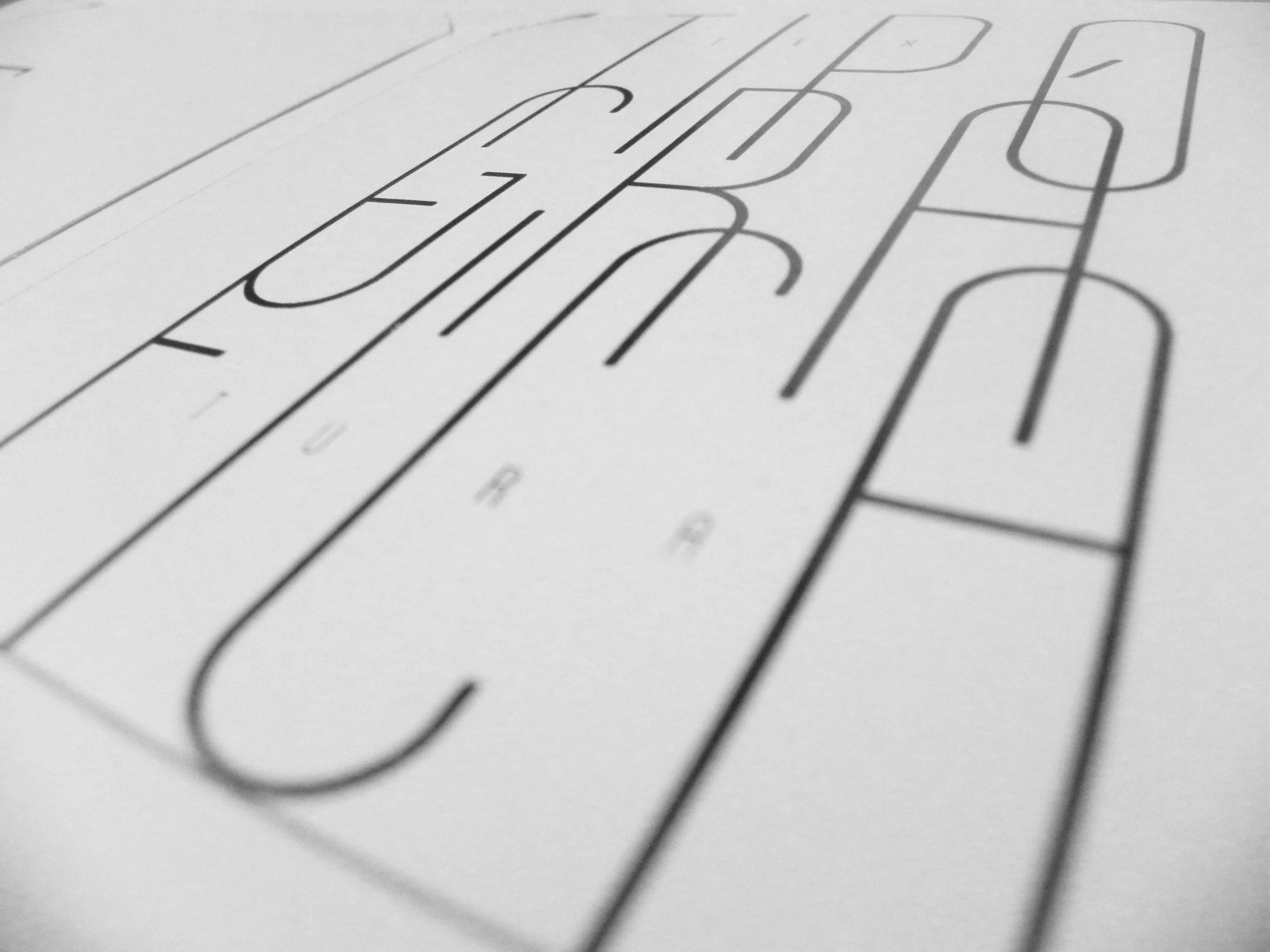
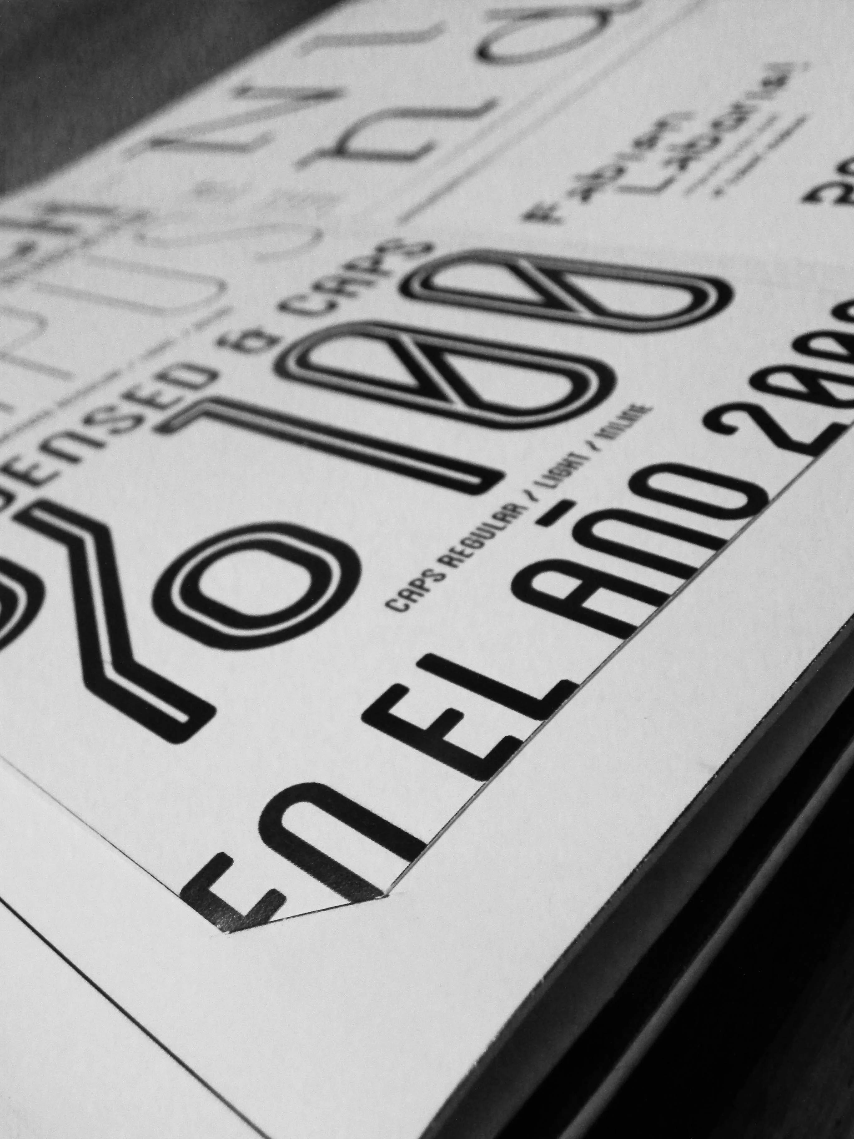
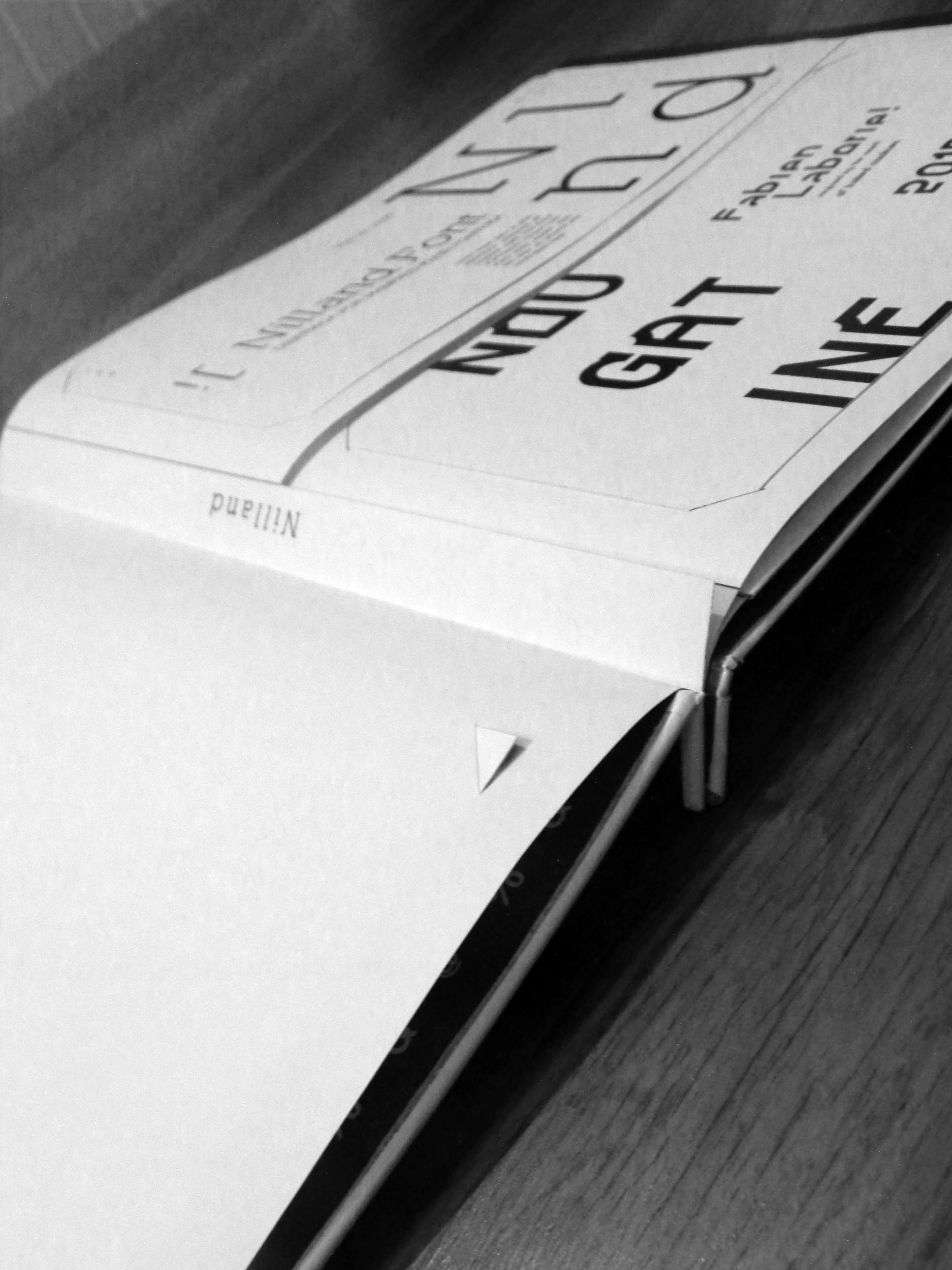
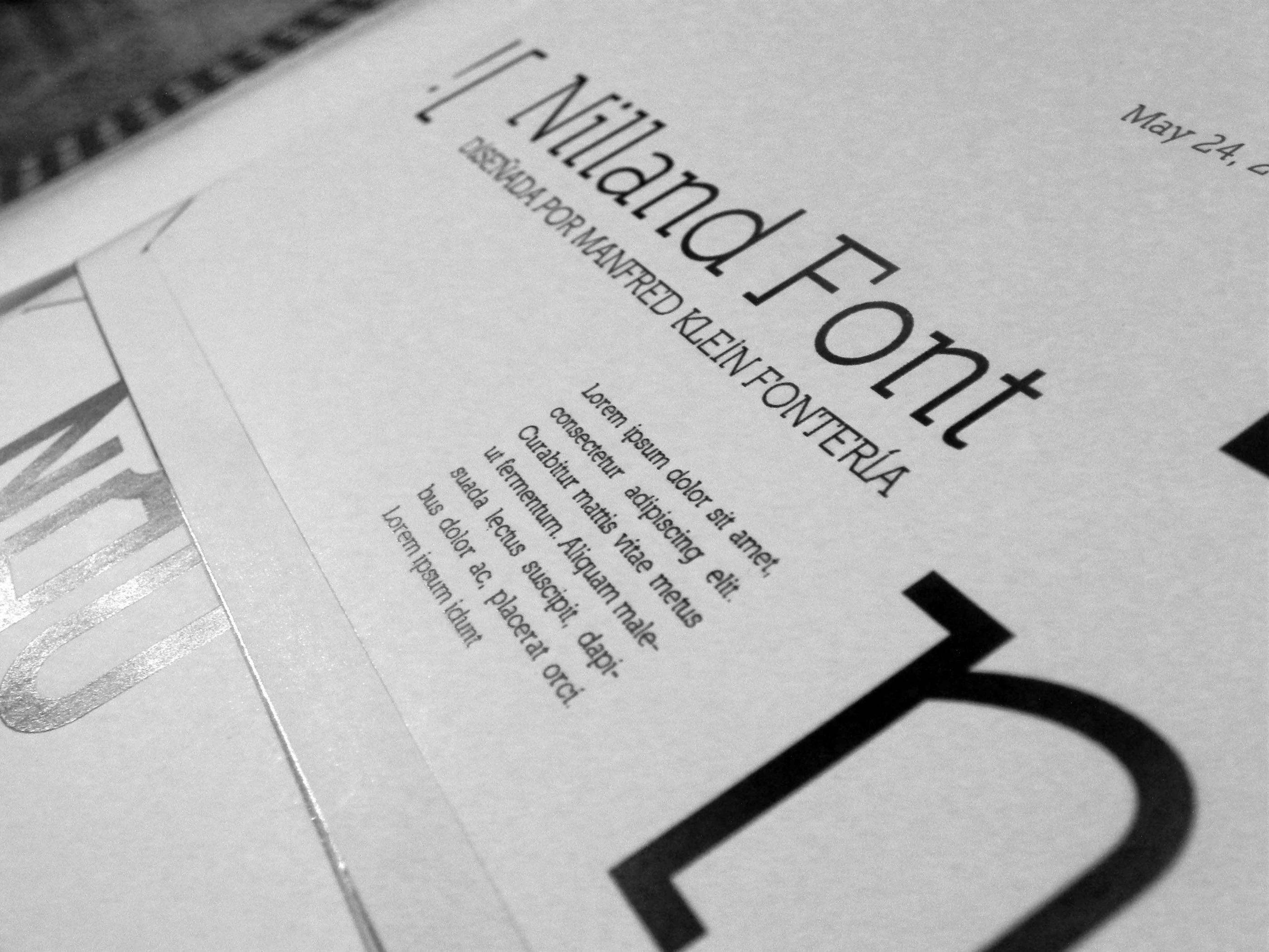
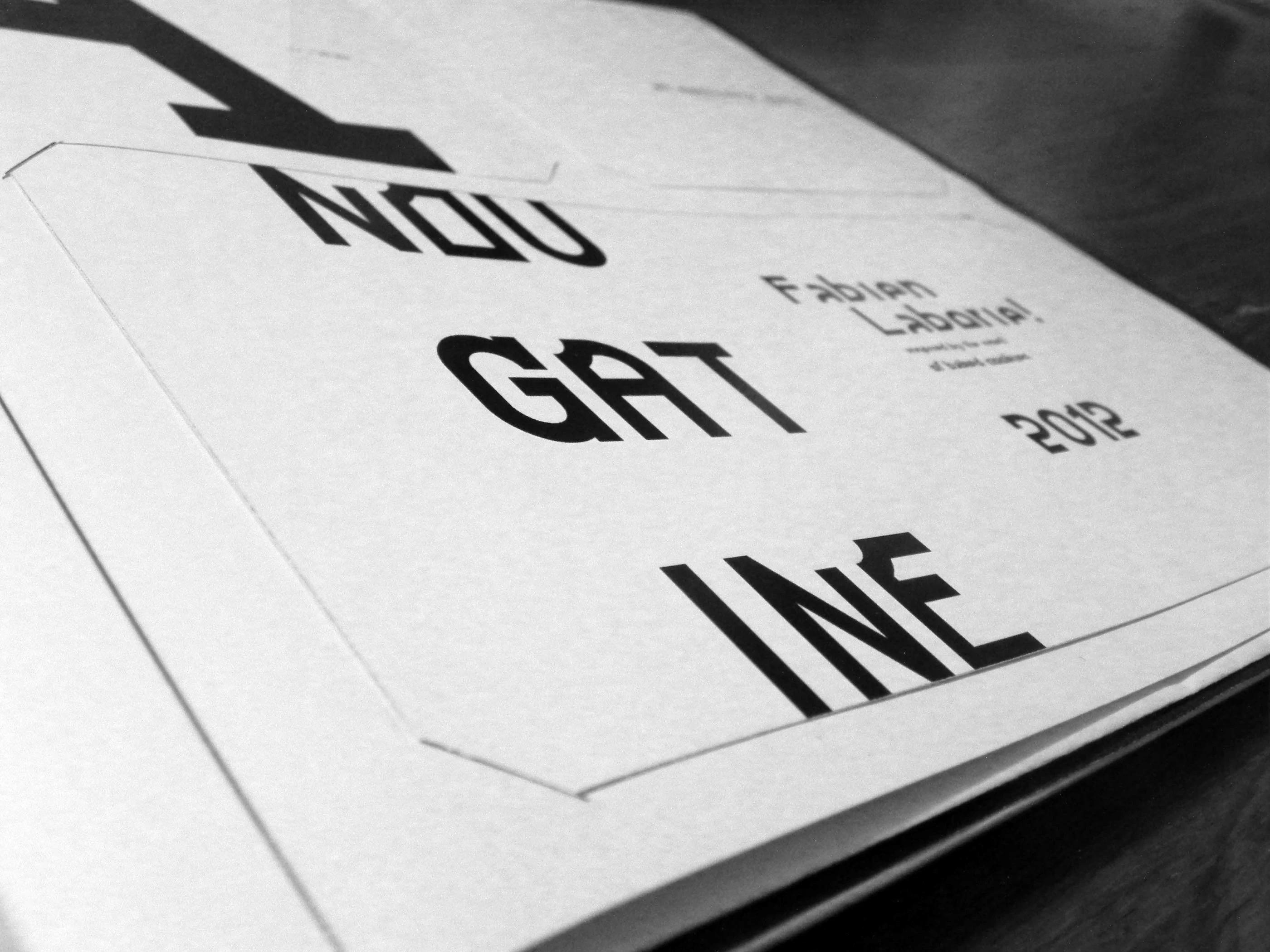
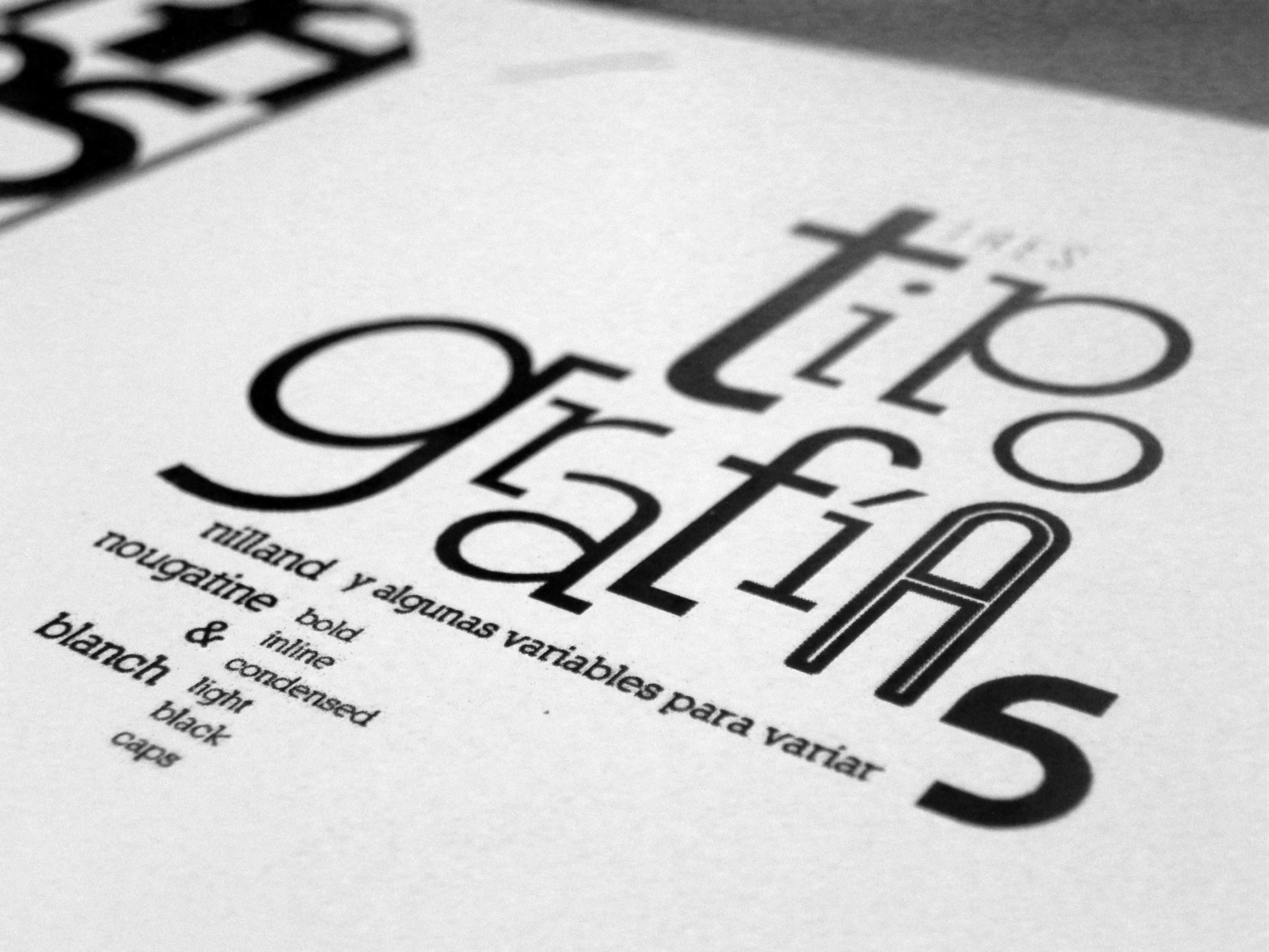
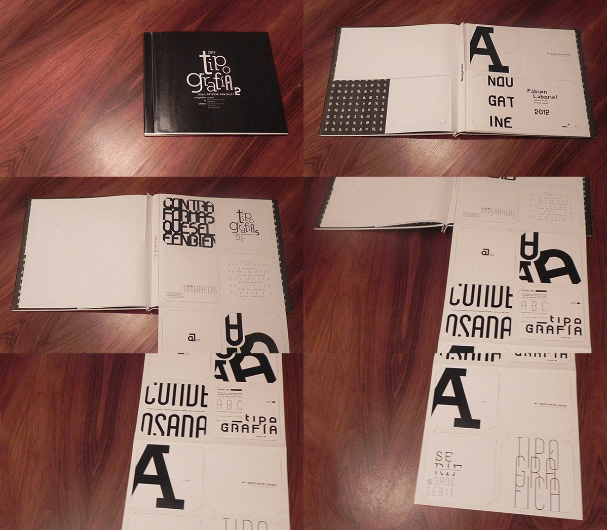
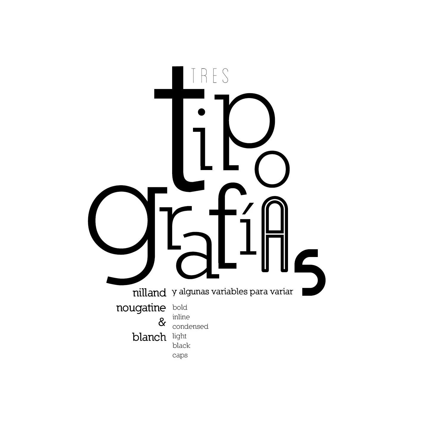
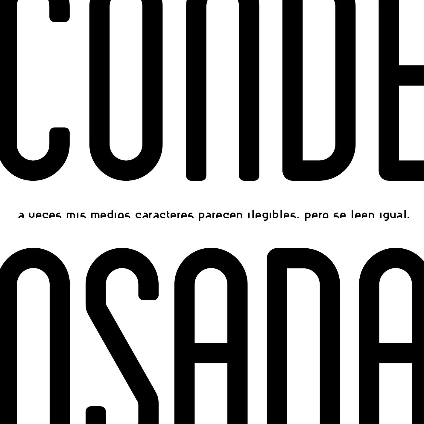
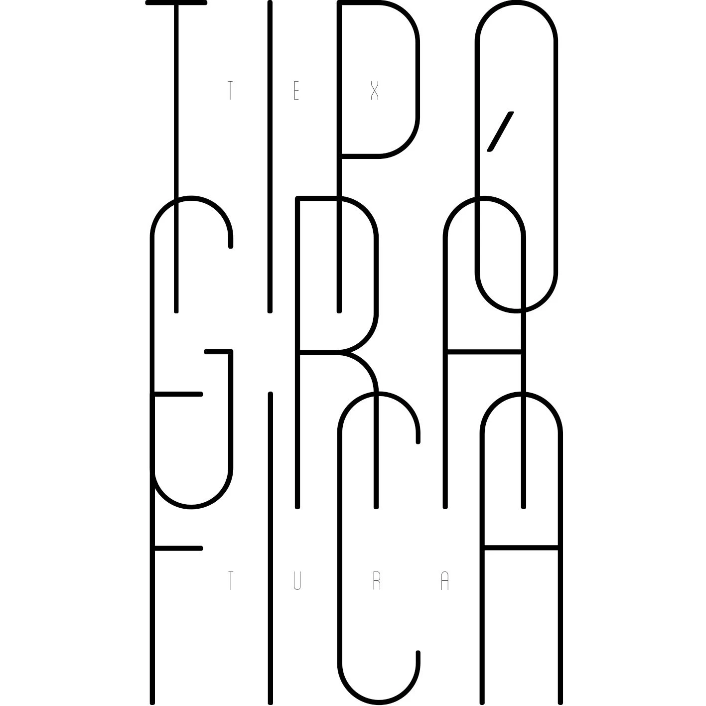
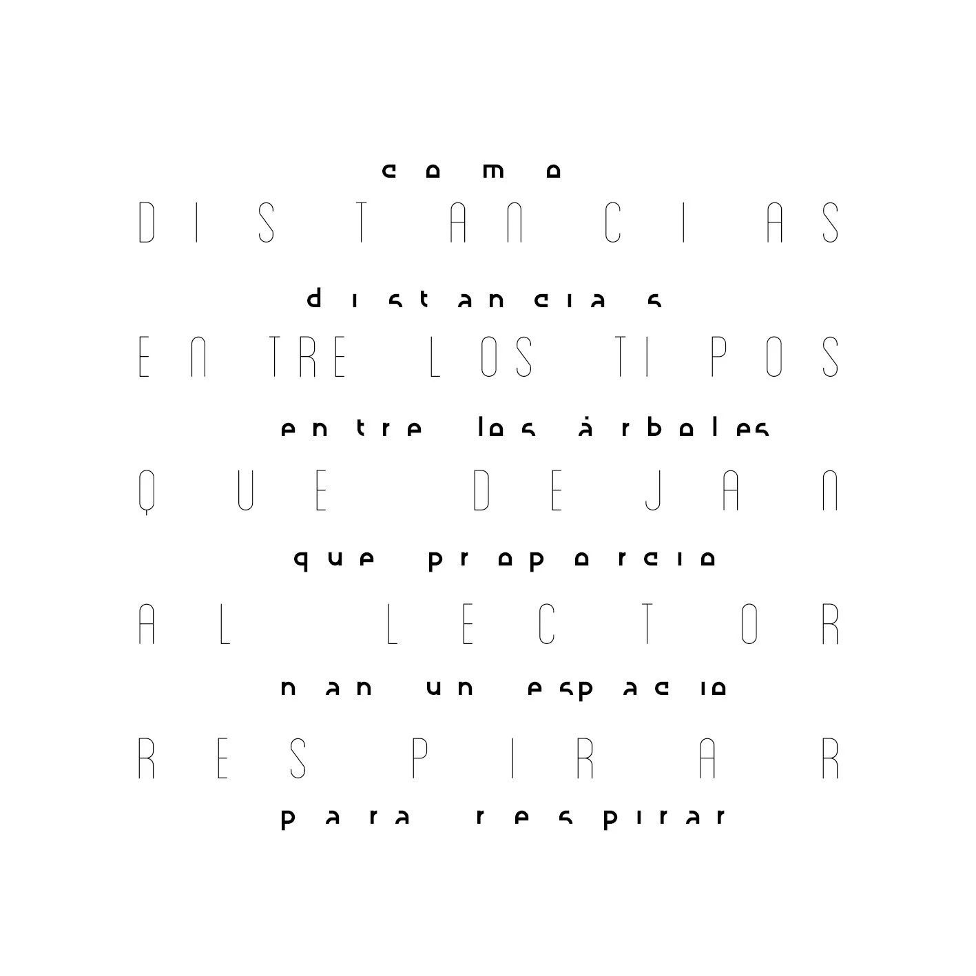
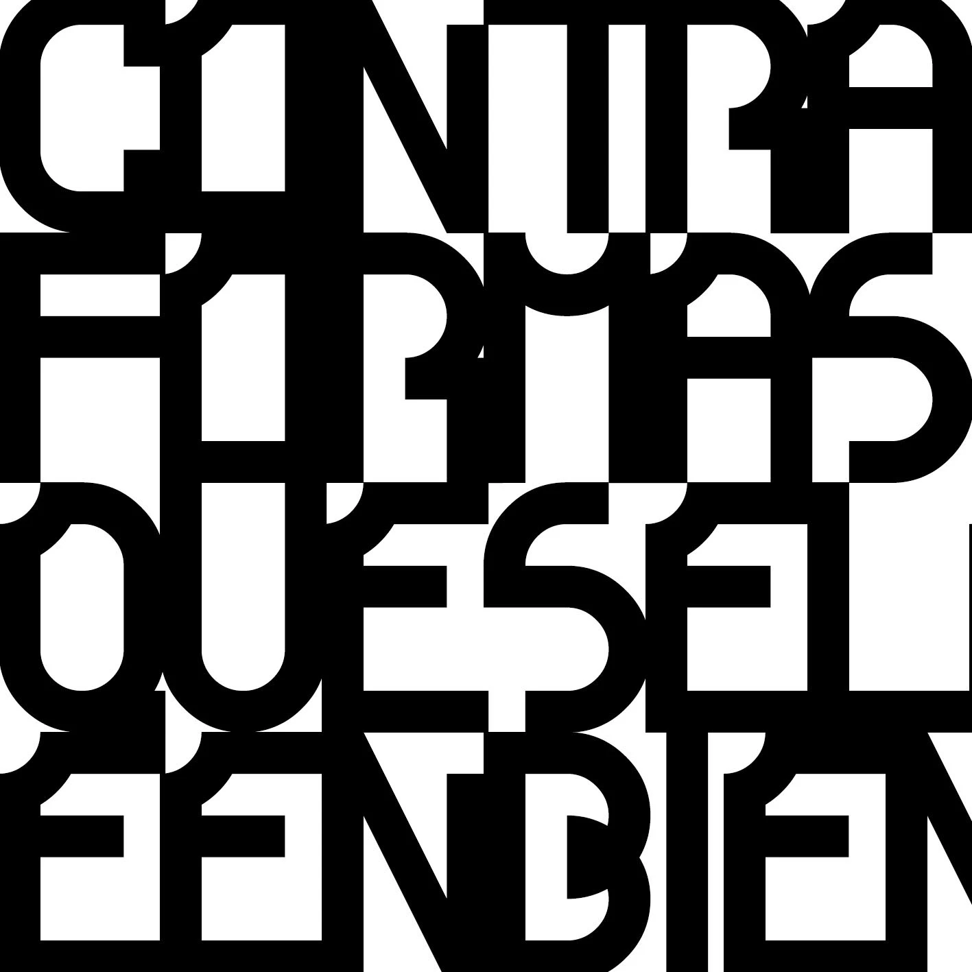
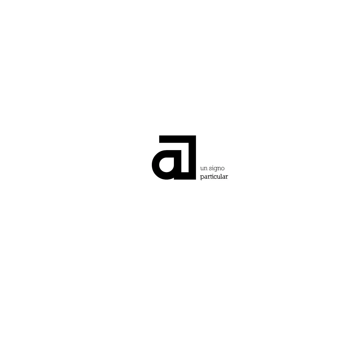
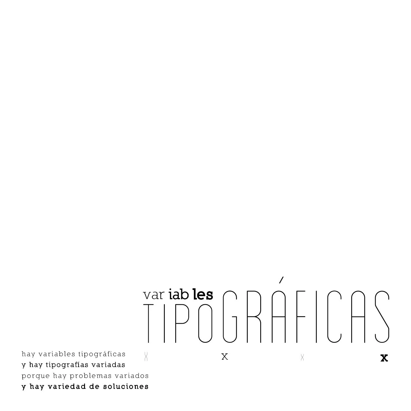
An exploration of composition possibilities using three typefaces: Nilland, Nougatine and Blanch. The work brings together digital layouts and photographs of the printed publication.
Overview
I explored how letterforms can act as both reading material and graphic form within an editorial sequence.
The Challenge
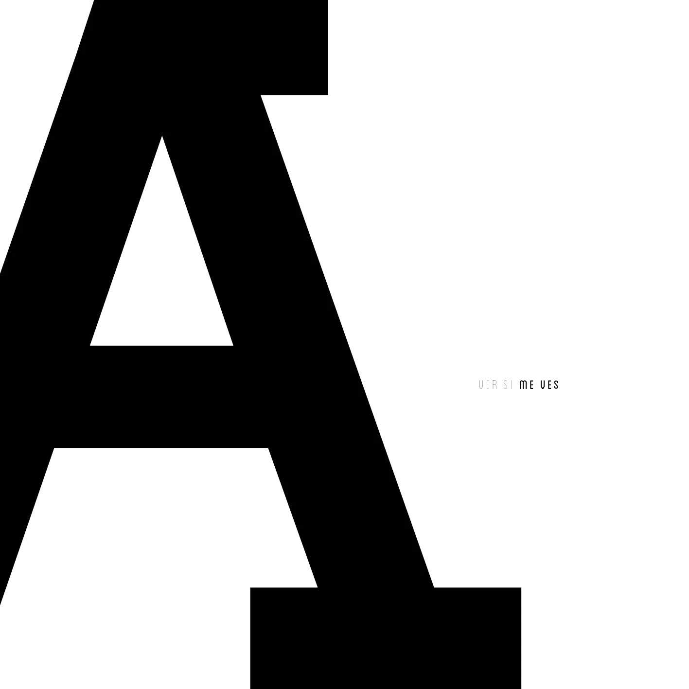
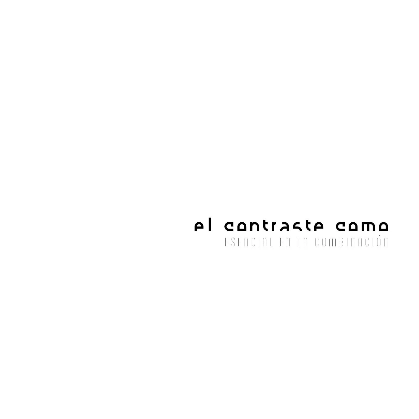
The challenge was to combine typefaces with different personalities while using contrast, scale and whitespace to hold the compositions together.
Process & Design Decisions
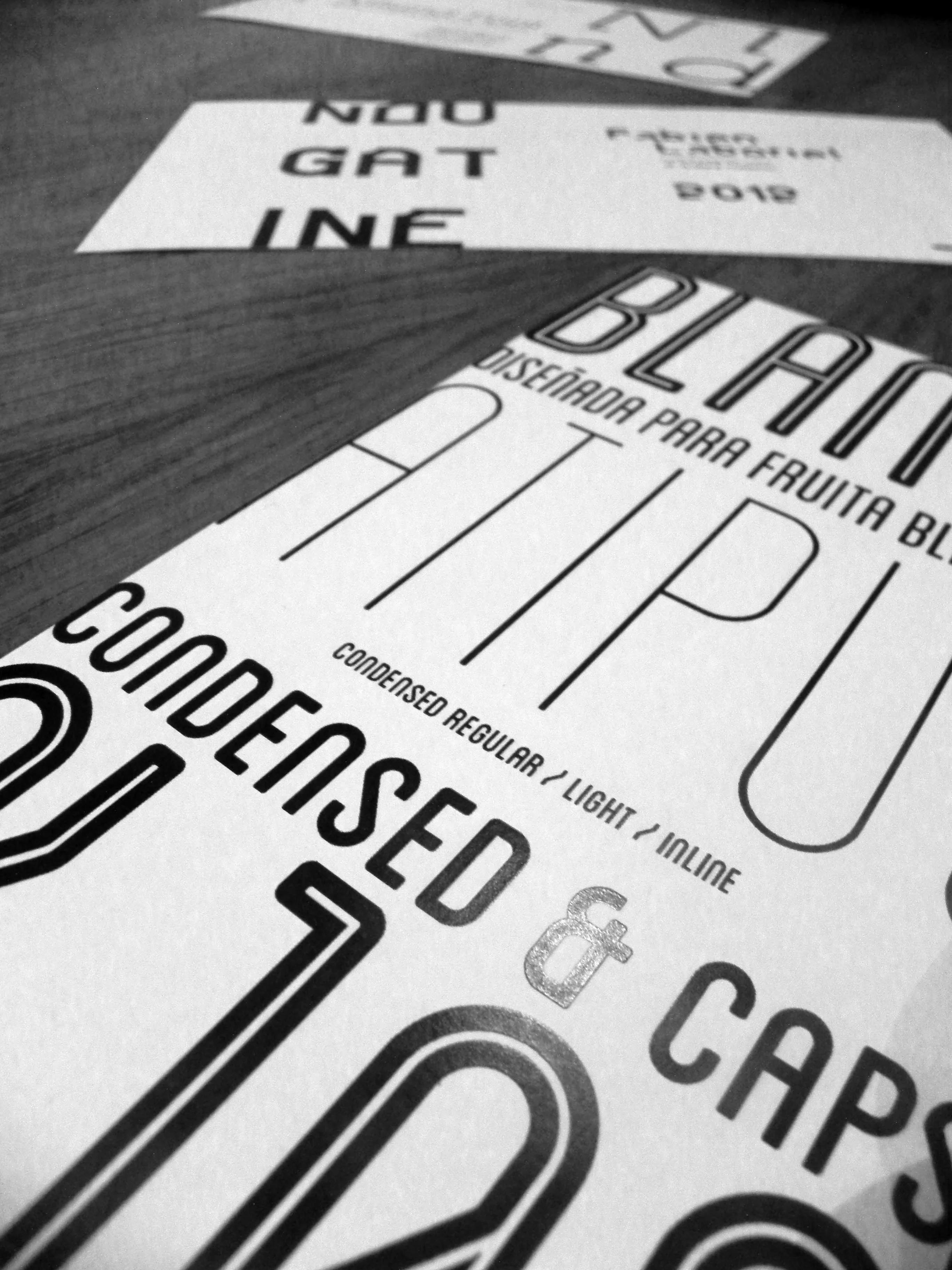
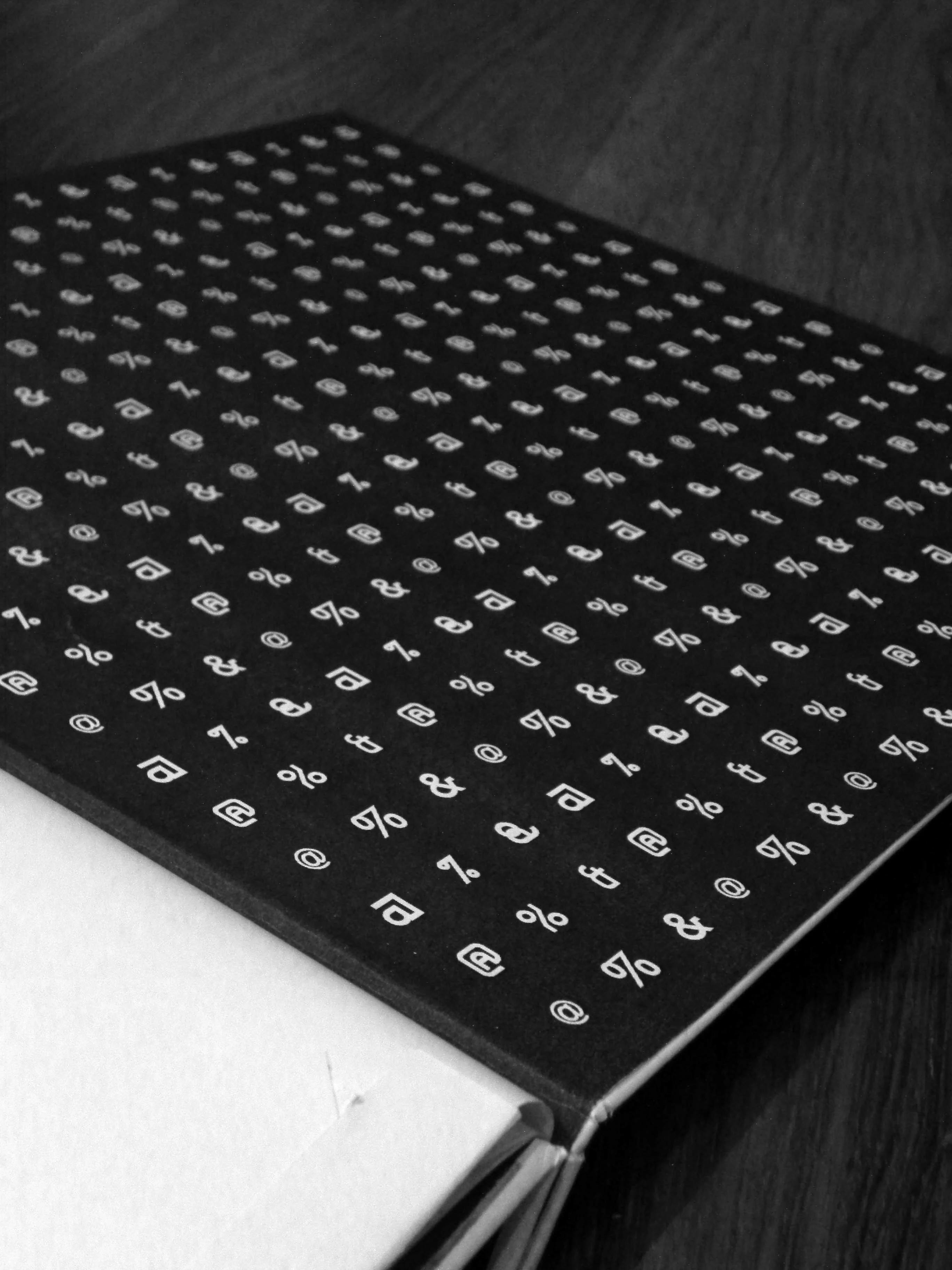
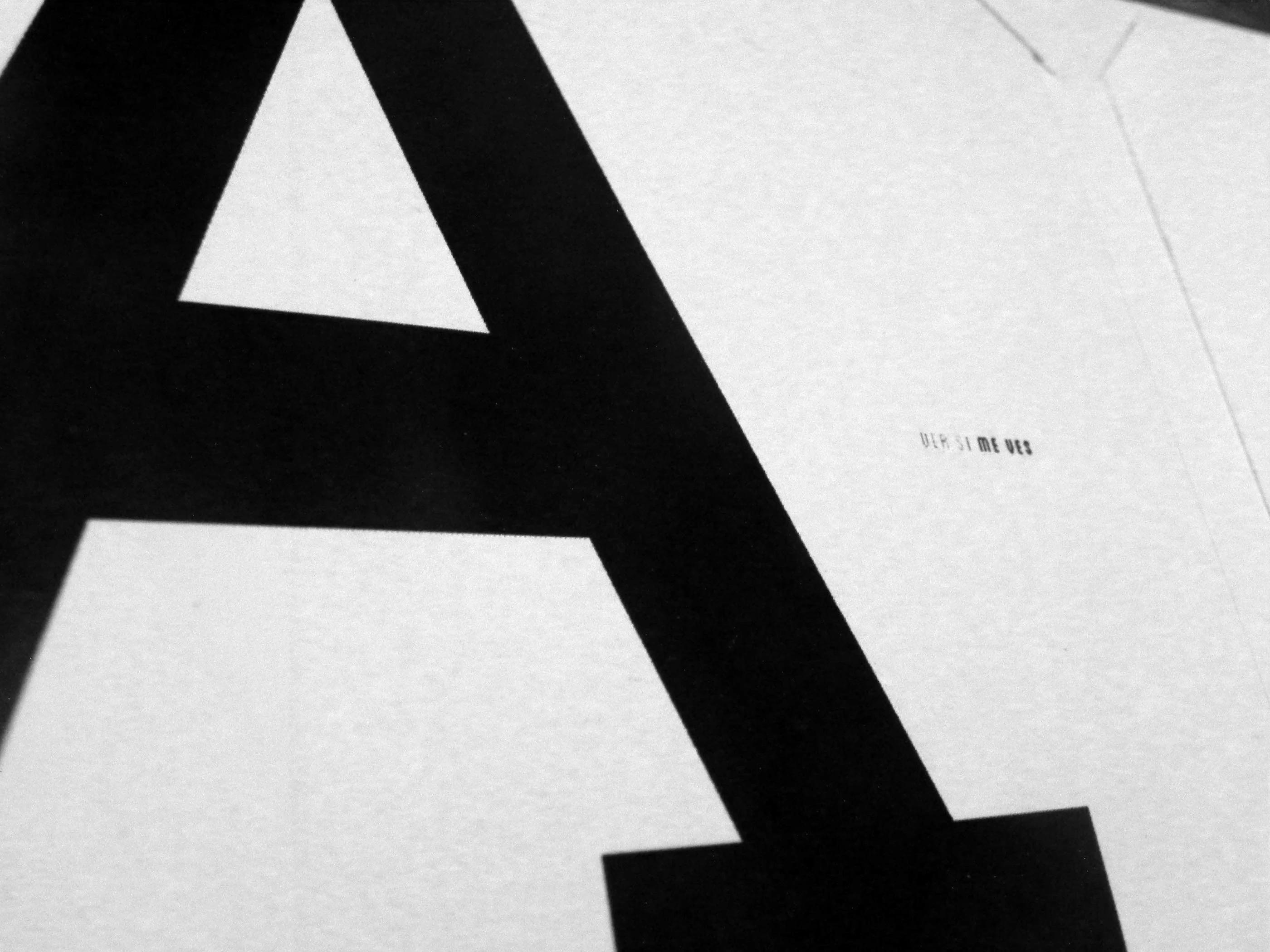
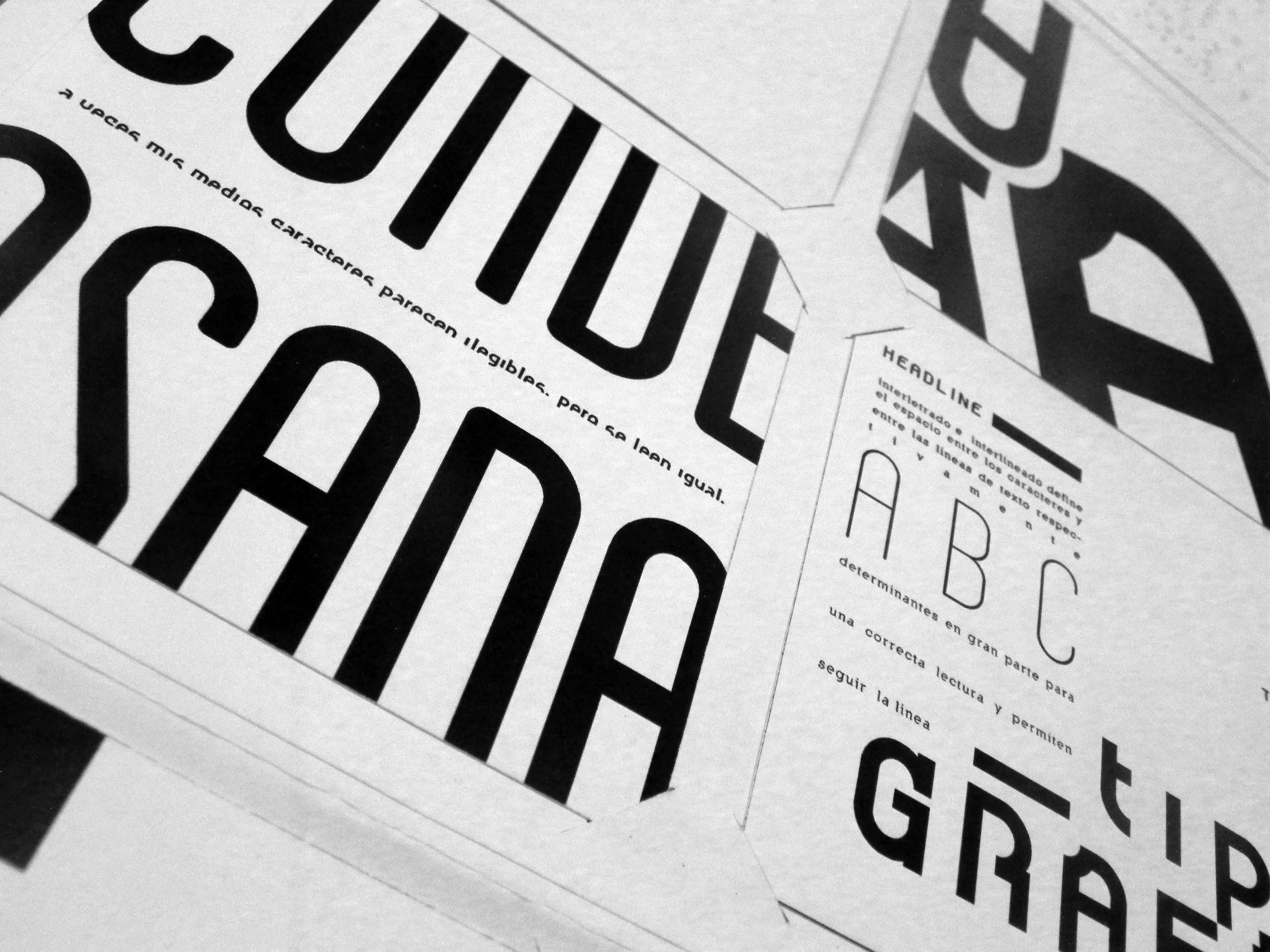
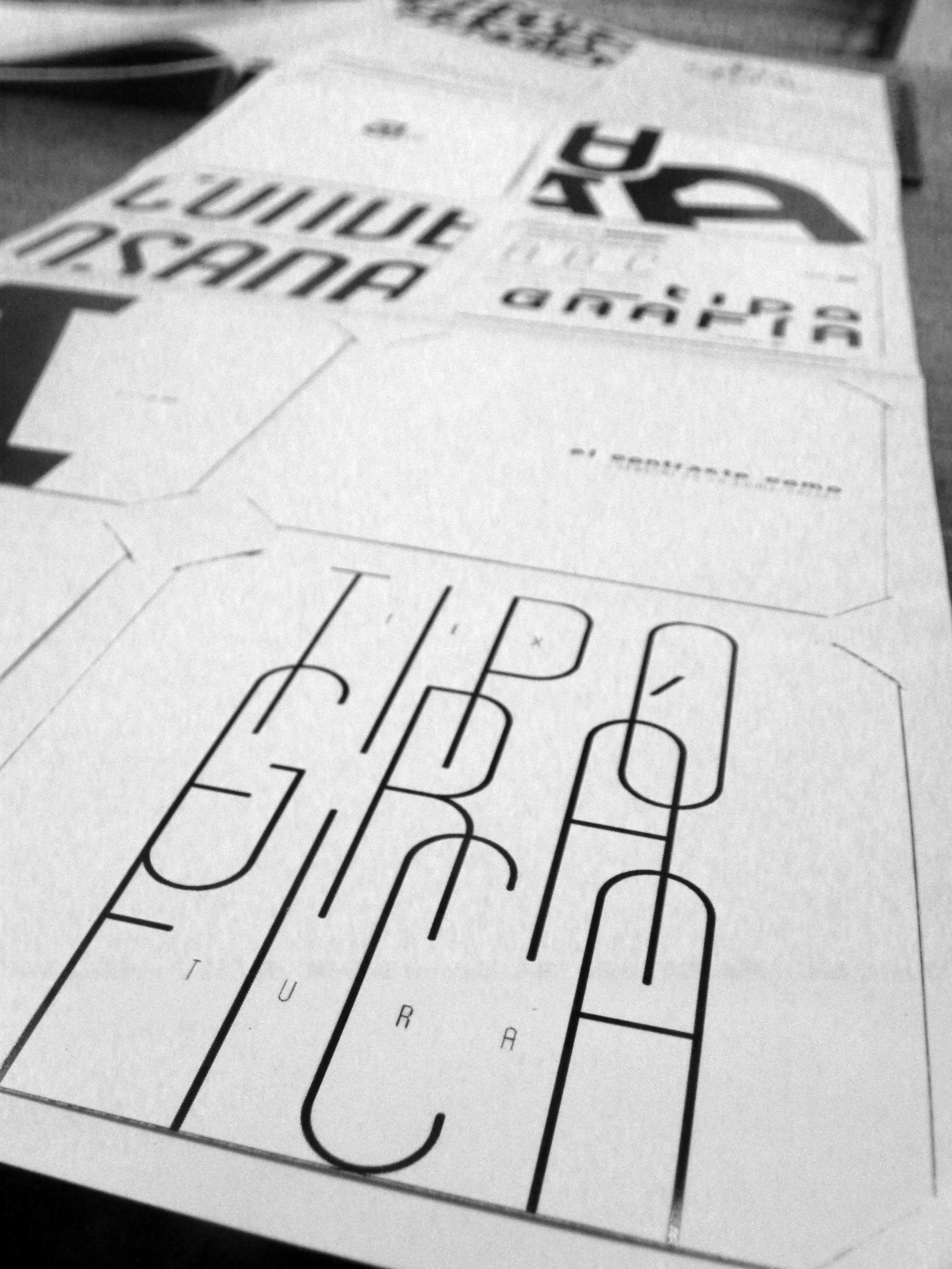
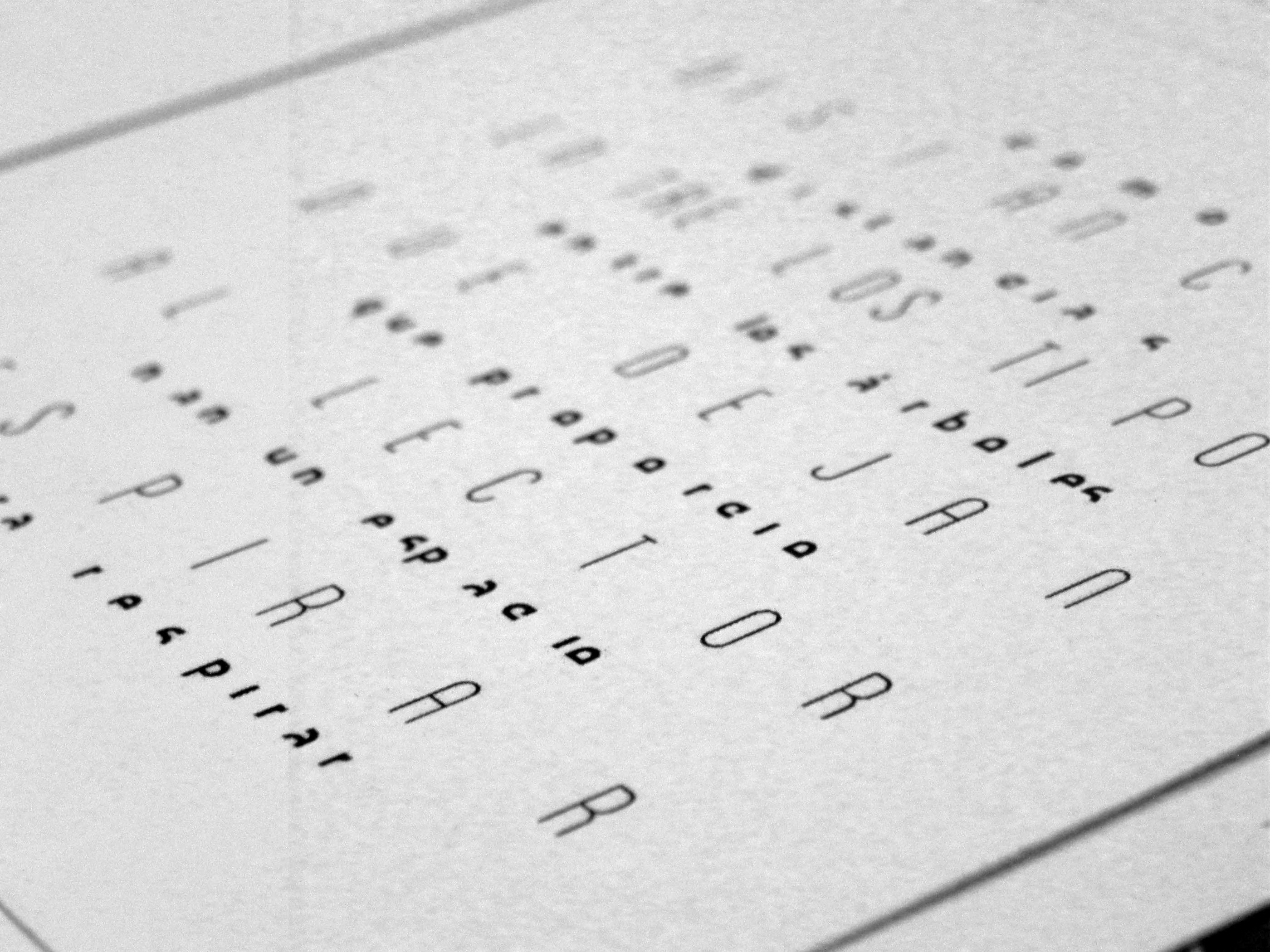
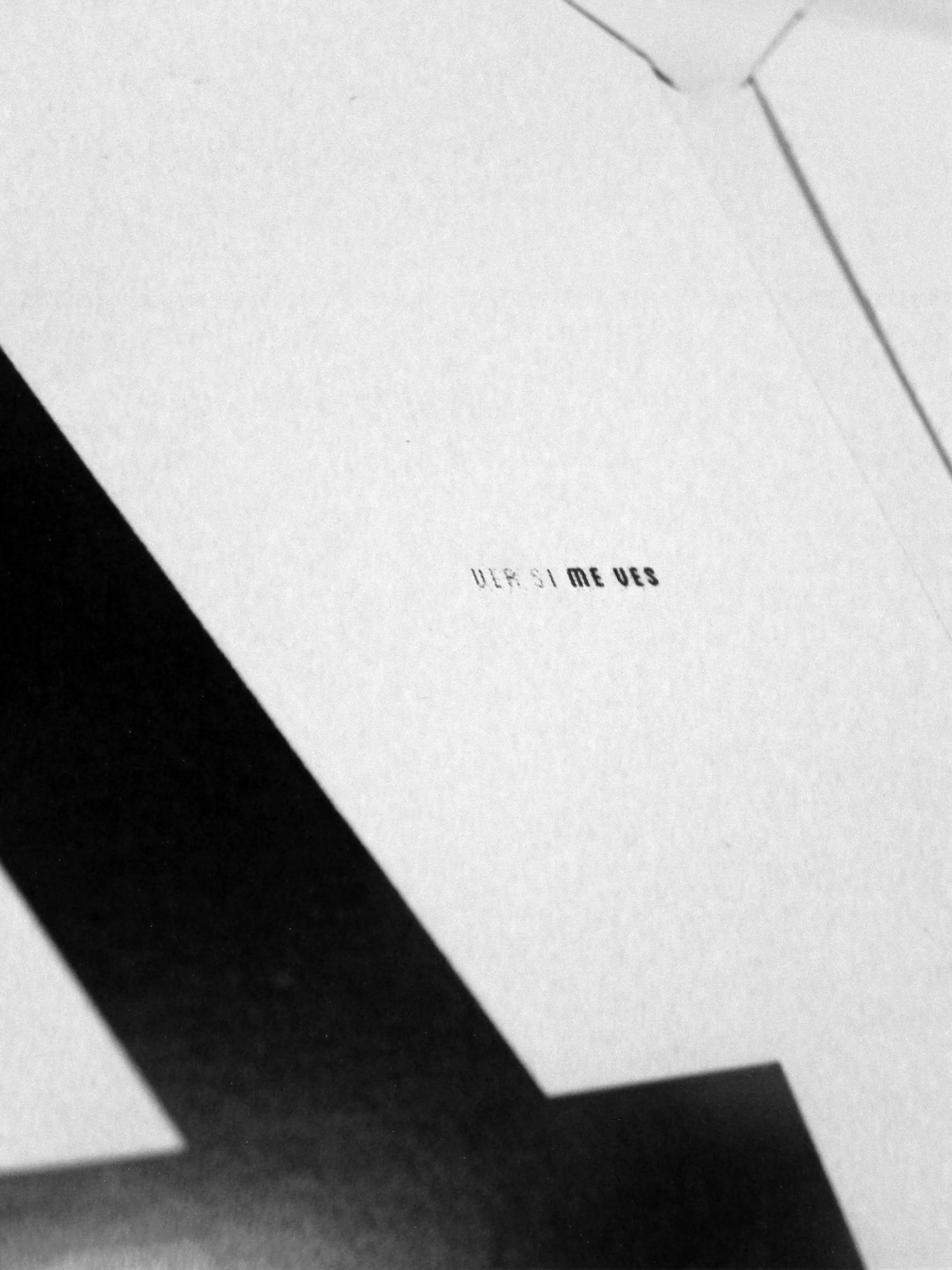
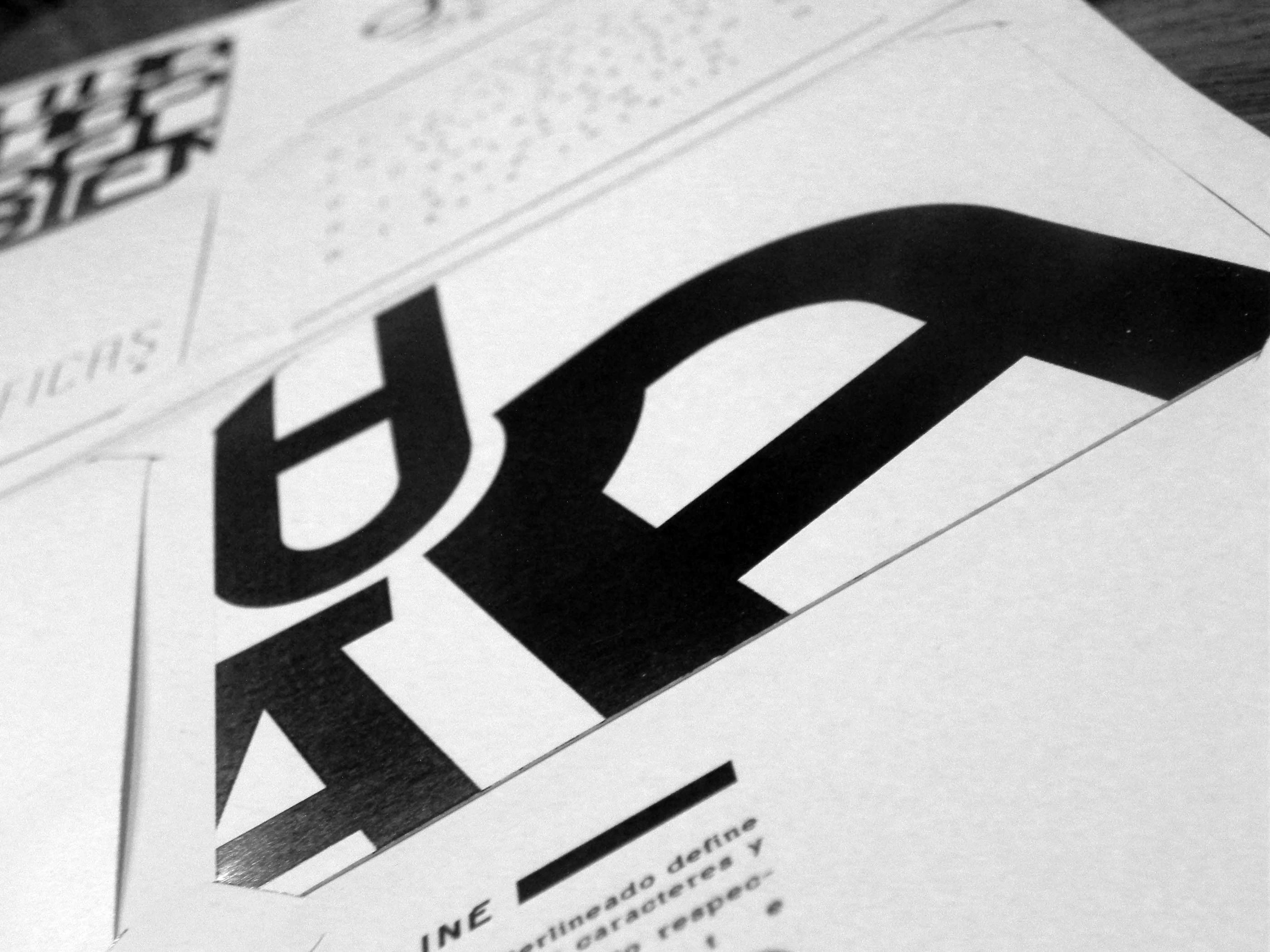
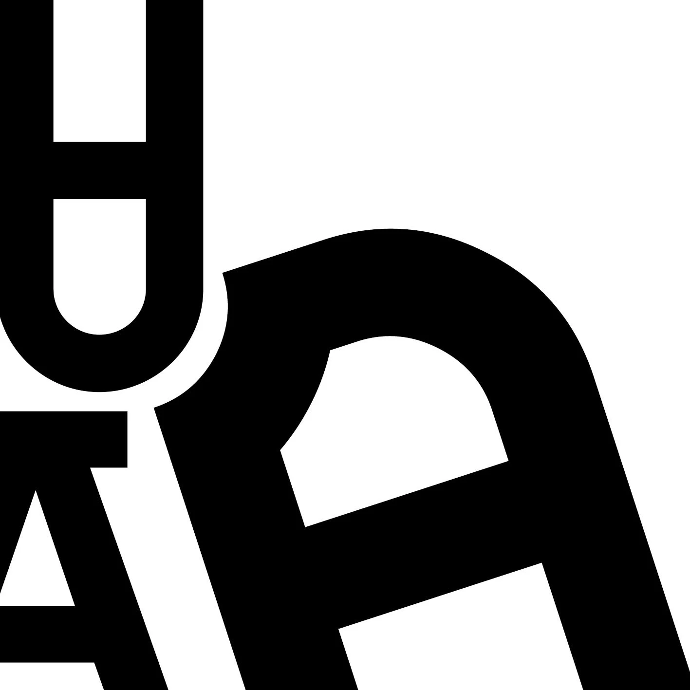
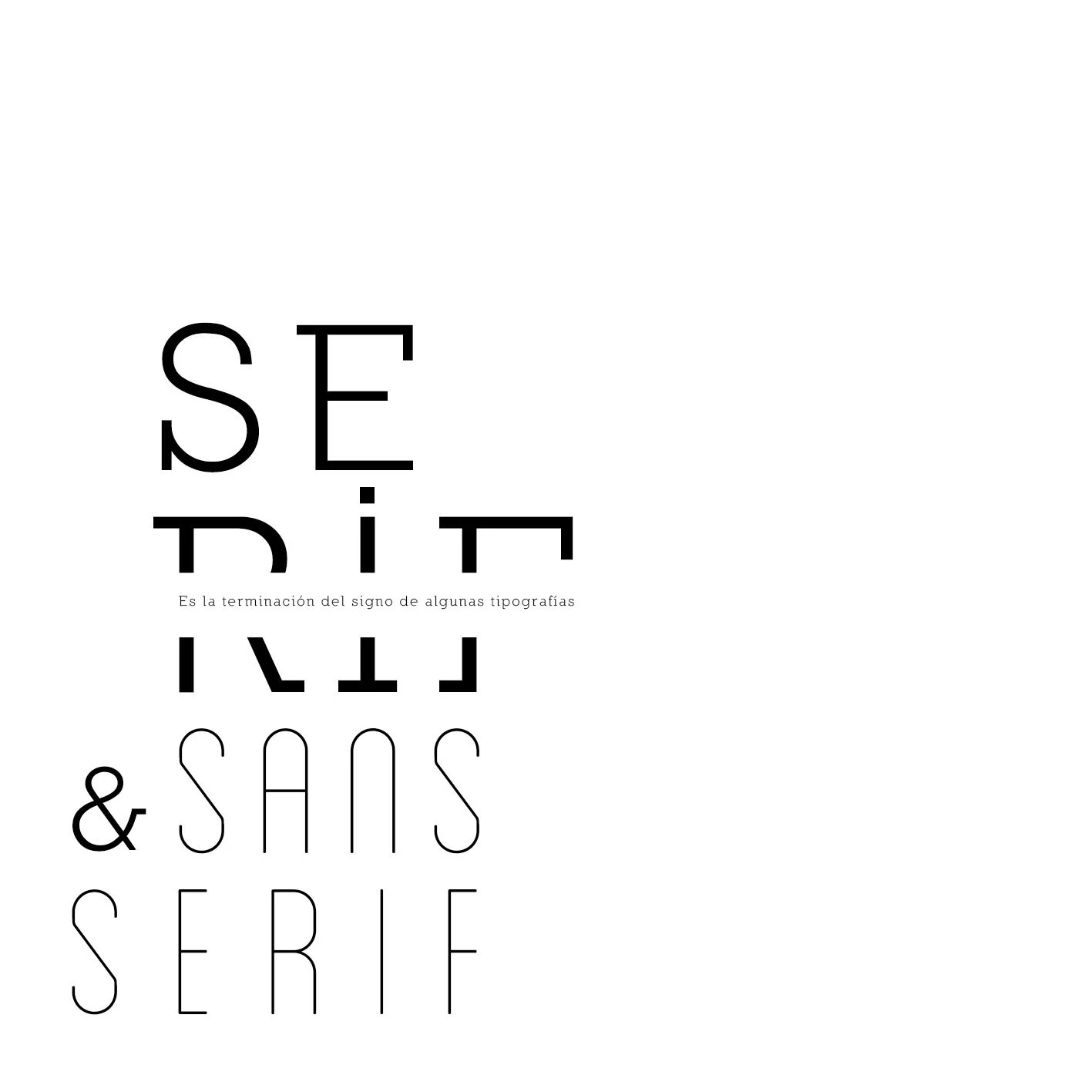
The layouts move between oversized cropped letters, compact blocks of text, thin strokes and dense typographic textures. A black-and-white palette keeps attention on the letterforms and the space around them.
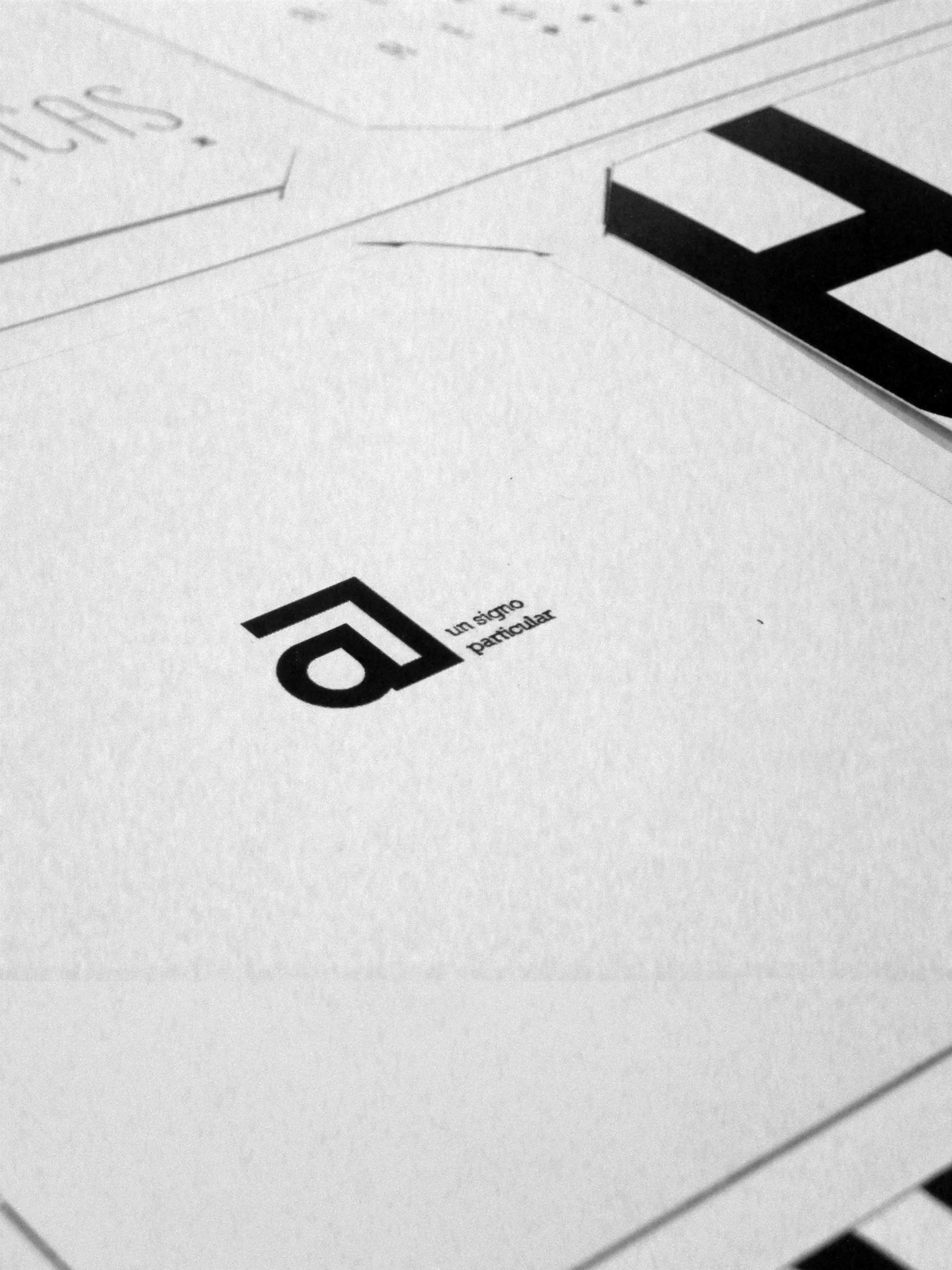
The printed photographs document how those contrasts translate into spreads, close-ups and the physical publication.
Results & Learnings
The result is a collection of typographic compositions and a printed edition. The exploration shows how rhythm and hierarchy can emerge from the form of the letters themselves, even with a deliberately restricted palette.
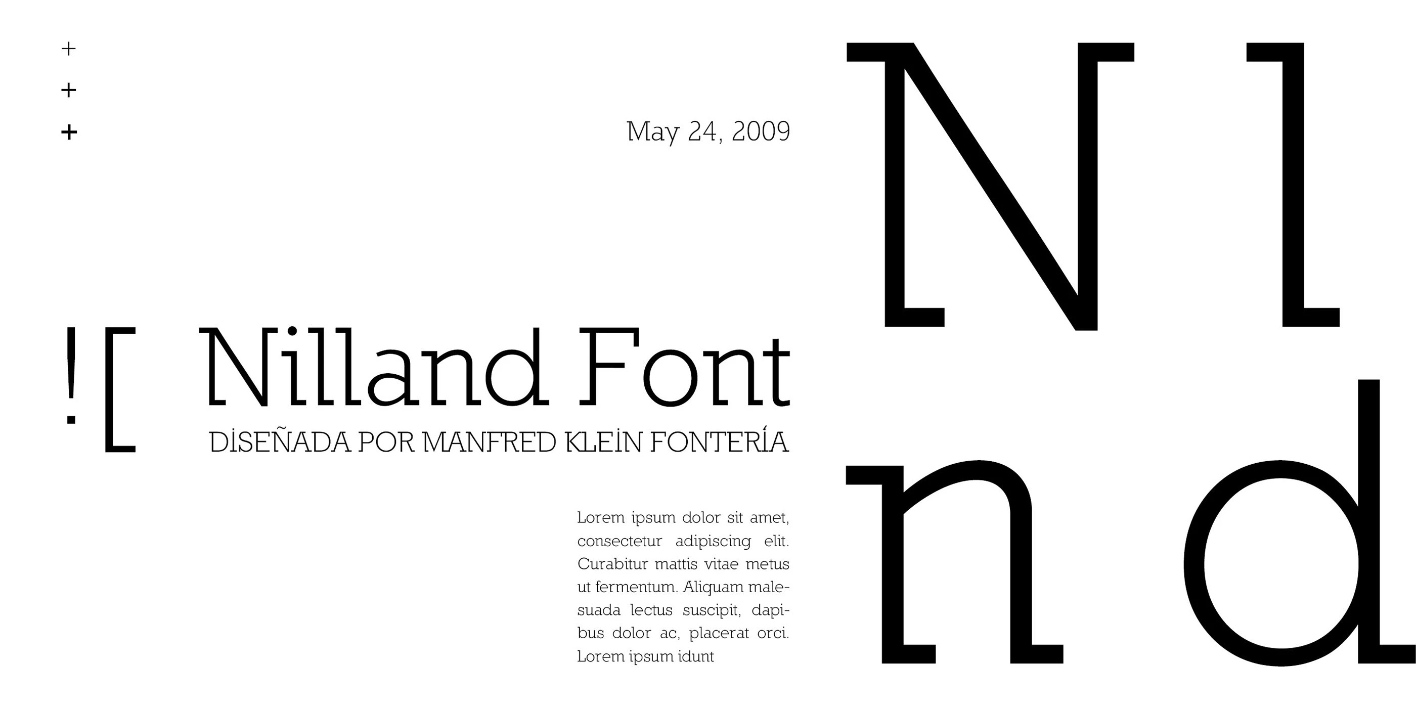
Nilland
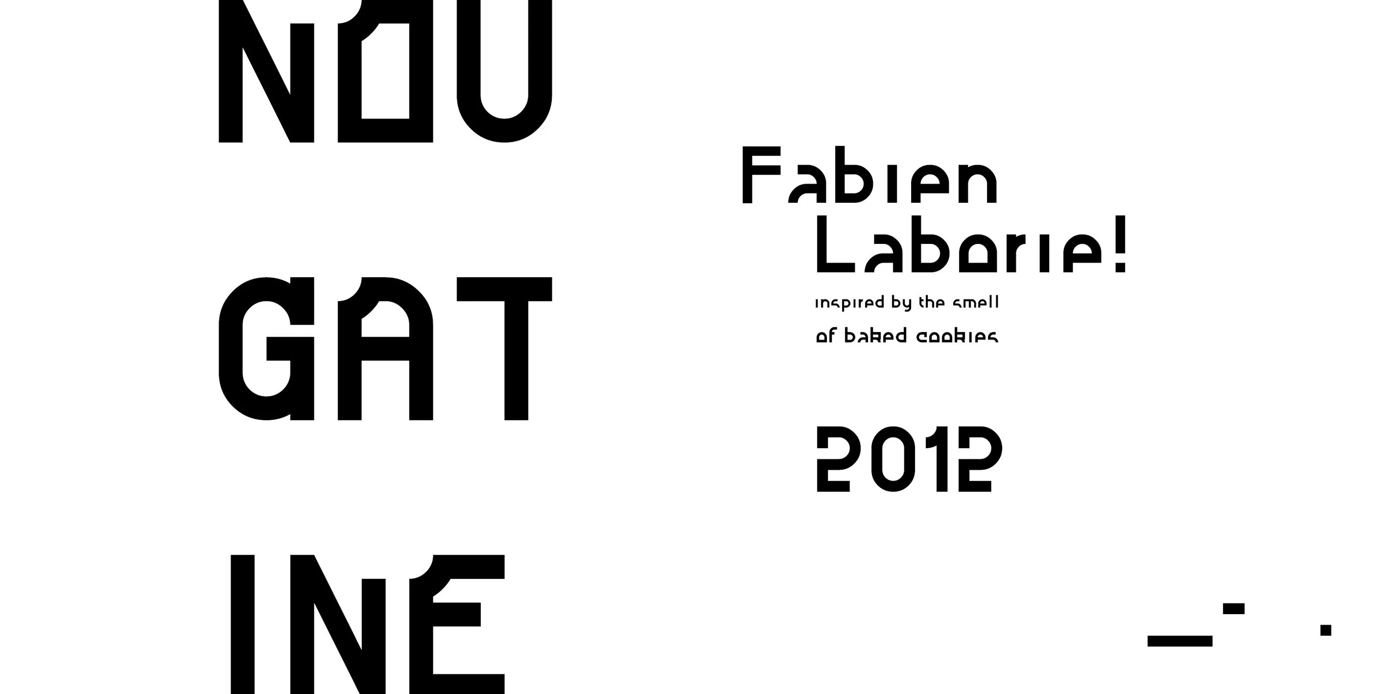
Nougatine
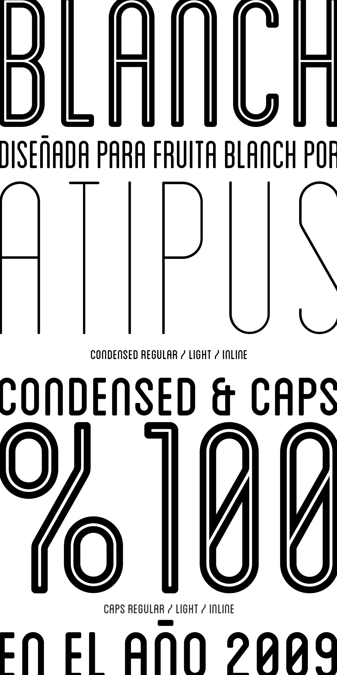
Blanch
Compositions
Printed